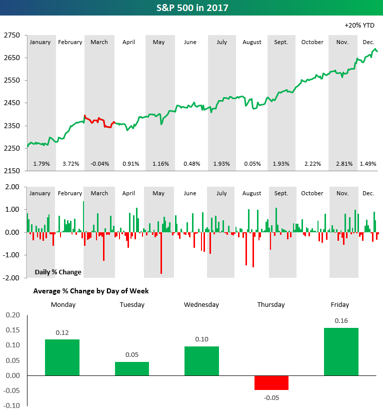
The set of charts below highlights the performance of the S&P 500 throughout 2017. In the top chart, we break down performance by month. The price line is green if the S&P posted gains during the month, and the line is red if the S&P posted a decline. As you can see, the index was up in price in 2017 in every month except March, and in March it only fell 0.04%. Talk about a consistently positive year!
The second chart in the set shows the daily change of the S&P 500 throughout the year. While there were certainly more up days than down days, the thing that stands out most is that the index didn’t see a gain or decline of more than 2% on any trading day in 2017.
The final chart in our set highlights the S&P 500’s average percentage change by weekday through 2017. As shown, every trading day of the week averaged a gain except for Thursday, which saw an average decline of 0.05% throughout the year.


Leave A Comment