
When Morgan Stanley’s chief equity strategist Michael Wilson released his 2018 equity outlook earlier this year, one particular observation struck us: a curious correlation between volatility and the shape of the yield curve we had not seen anywhere previously.
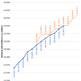
In his discussion in late November 2017, Wilson explains why he expected bigger volatility in the coming year, and why he thought”things will change in 2018″ he shows the following chart which illustrates an interesting relationship between equity volatility and the economic cycle.
It shows that the 2s-10s yield curve tends to lead the VIX by 2 ½ years.

He explains:
You will notice that in the past 6 months, this impressive 25 year relationship has broken down with the VIX continuing to significantly fall even though the curve flattening that began 3 years ago would have suggested a rise by now. We think this is a reflection of the very supportive fundamental environment described above and the “give up” by traders who have succumbed to the trend and even turned to methodically selling volatility.
Furthermore, many retail products have been created to sell vol and may have exacerbated the trend and overshoot to the downside. As economic data and earnings estimate dispersion increases next year, the underlying trend will likely reverse and these products will only serve to make the reversal more persistent than what we have experienced the past few years.
At the time we noted that the chart Wilson is referring to should lead to a few sleepless nights for those who keep selling vol on even the smallest of VIX spikes. What it indicated, in November 2017, was that if historical correlation is maintained, the VIX should be just shy of 30 within a few months, (a level we said would have catastrophic consequences for virtually all vol-selling funds, including retail investors, active at the time).


Leave A Comment