
In light of the 30-year anniversary of the Black Monday Crash in 1987 (when the Dow lost more than 20% in “one day”), we should be reminded that investor anxiety usually increases when markets get to extremes. If stock prices fall steeply, people fret about money lost, and if they move too high too fast, they worry about sudden reversals. As greed is supposed to be counterbalanced by fear, this relationship should not be surprising. But sometimes the formula breaks down and stocks become very expensive even while investors become increasingly complacent. History has shown that such periods of untethered optimism have often presaged major market corrections. Current data suggests that we are in such a period, and in the words of our current President, we may be “in the calm before the storm.”
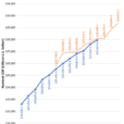
Many market analysts consider the Cyclically Adjusted Price to Earnings (CAPE) ratio to be the best measure of stock valuation. Also known as the “Shiller Ratio” (after Yale professor Robert Shiller), the number is derived by dividing the current price of a stock by its average inflation-adjusted earnings over the last 10 years. Since 1990, the CAPE ratio of the S&P 500 has averaged 25.6. The ratio got particularly bubbly, 44.2, during the 1999 crescendo of the “earnings don’t matter” dotcom era of the late 1990’s. But after the tech crash of 2000, the ratio was cut in half, drifting down to 21.3 by March of 2003. For the next five years, the CAPE hung around historic averages before collapsing to 13.3 in the market crash of 2008-2009. Since then, the ratio has moved steadily upward, returning to the upper 20s by 2015. But in July of this year, the CAPE breached 30 for the first time since March 2002. It has been there ever since (which is high when compared to most developed markets around the world). (data from Irrational Exuberance, Princeton University Press 2000, 2005, 2015, updated Robert J. Shiller)
But unlike earlier periods of stock market gains, the extraordinary run-up in CAPE over the past eight years has not been built on top of strong economic growth. The gains of 1996-1999 came when quarterly GDP growth averaged 4.6%, and the gains of 2003-2007 came when quarterly GDP averaged 2.96%. In contrast Between 2010 and 2017, GDP growth had averaged only 2.1% (data from Bureau of Economic Analysis). It is clear to some that the Fed has substituted itself for growth as the primary driver for stocks.
Investors typically measure market anxiety by looking at the VIX index, also known as “the fear index”. This data point, calculated by the Chicago Board Options Exchange, looks at the amount of put vs. call contracts to determine sentiment about how much the markets may fluctuate over the coming 30 days. A number greater than 30 indicates high anxiety while a number less than 20 suggests that investors see little reason to lose sleep.


Leave A Comment