Are US stock markets over-extended? Are we about to witness a US market crash or a healthy pullback before the rally resumes in the US equity market? These are questions that are keeping many analysts and investors up at night and for good reason.
Our article today will answer these questions by reviewing what the Dow Theory indicates for the performance of the equity market.
Since the beginning of 2018, our research team reviewed multiple market indicators and correlations . We are constantly monitoring and analyzing the global equity markets movements to assess and forecast the next move in global markets. Through our intermarket analysis, we take clues from the U.S. 20 year yields, a leading indicator for U.S. stock markets. We also monitor the strength of small caps to gauge the risk appetite by measuring the strength of the Russell 2000. The performance of the Yen, an important safe haven asset is also another major leading indicator.
All these indicators, at press time, are still indicating that the US stock market has more upside ahead. In other words, we are still in a Bull market and the pullbacks we are seeing are healthy, even necessary for the continuation of the Rally.
Dow Theory Confirms our Bullish Outlook
The Dow Theory Explores the performance of the Dow Jones Industrial and the Dow Jones Transportation indexes. In short, both indexes should move in a tandem. If one goes up, the other should follow in the same direction quickly thereafter. A divergence in the performance of the Dow Jones Industrial and the Dow Jones Transportation means that a reversal is about to happen in the stock market.
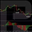
When we look at the performance of both the DJ Industrial and transportation, both are at a major support area; both seem likely to take an upwards direction (path of the least resistance seems upwards). The Dow Jones industrials are even showing a strong continuation pattern: a Bullish Falling Wedge that will likely resolve with a breakout to the upside especially considering the strong support level annotated in Blue (see chart below).


Leave A Comment