
Written by Jill Mislinski
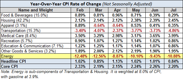
Here is a table showing the annualized change in Headline and Core CPI, not seasonally adjusted, for each of the past six months. Also included are the eight components of Headline CPI and a separate entry for Energy, which is a collection of sub-indexes in Housing and Transportation.
We can make some inferences about how inflation is impacting our personal expenses depending on our relative exposure to the individual components. Some of us have higher transportation costs, others medical costs, etc.
A conspicuous feature in the year-over-year table is the volatility in energy, significantly a result of gasoline prices, which is also reflected in Transportation.
Here is the same table with month-over-month numbers (not seasonally adjusted). The nose-dive and subsequent recent increase in energy costs is clearly illustrated, reflected here too in transportation.

The Trends in Headline and Core CPI
The chart below shows Headline and Core CPI for urban consumers since 2007. Core CPI excludes the two most volatile components, food and energy. We’ve highlighted the 2% level that the Federal Reserve is targeting for inflation, although the Fed traditionally uses the Personal Consumption Expenditure (PCE) price index as their preferred inflation gauge.
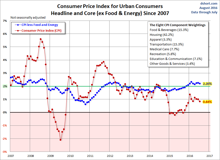
Year-over-year Core CPI (the blue line) has been above 2% for the last six months and was below 2% for 38 out of the last 48 months. The more volatile Headline CPI has spent 45 of the past of the past 48 months under the 2% lower benchmark. Much of the volatility in the past few years has been the result of broad swings in gasoline prices (more on gasoline here).
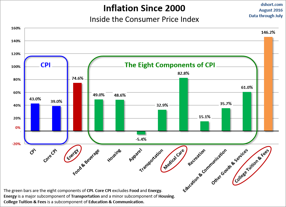
For a longer-term perspective, here is a column-style breakdown of the inflation categories showing the change since 2000.


Leave A Comment