
Deflation seems to be the primary theme in the market as we come to the end of October.
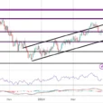
The last time the Dow Jones saw its BEV value at -8% was in early July of this year (BEV chart below). It took fifty-three NYSE trading sessions for the bulls to work up to a new all-time high on September 20th. The last Dow Jones all-time high was on October 3, from where it took Mr. Bear only fifteen NYSE trading sessions to deflate the Dow down to -8.37% on Wednesday this week.
Looking at the Dow Jones’ BEV chart, we see the same thing happening at the end of January; the Dow Jones breaking down sharply, correcting by 11% at the end of March. At which point the venerable Dow began a six month recovery that included four new all-time highs in late September and early October.

That could happen again, and then maybe not. Two factors working against a repeat of the January/October correction and recovery scenario are bond yields continue to rise, and the Federal Reserve’s policy of raising its Fed Funds Rate seems intact, despite the current problems in the stock market.
Another factor working against a continuation in a market advance is the Federal Reserve is draining the financial system of the “liquidity” it injected into it with its three bouts of quantitative easings (QE 1-3 below). In October it reduced its balance sheet by $37.91 billion dollars. Small potatoes when compared to the increases seen in the spring and summer of 2009, but at some point this “quantitative tightening” (QT) by the Federal Reserve is going to trigger deflationary forces now latent in the stock and bond markets.

Here’s a table listing how the major market indexes I follow are doing. The BEV column shows the percentage declines from their last all-time highs, and the 27-Oct-16 column gives their percentage advances in the past two years, or how much of the amazing President Trump post-election market advance they have retained at week’s end.
The financials are a bit concerning to me (#14, 18 & 19). The NASDAQ Insurance index is down 12.58%, and has managed to hold on to only 3.91% of its gains of the past two years.This tells us that the two-year gain for this index wasn’t much to begin with.
Seeing the NASDAQ Banks and NYSE Financials at the bottom of this table isn’t good. These were the companies that lead the stock market down during the sub-prime mortgage crisis. Are we are seeing this developing again?

No one speaks of it anymore, but a decade ago to get the financial system back on its feet during the mortgage crisis, the “policy makers” sent trillions of dollars into the banking system to keep it afloat. They also altered the banking system’s accounting standards to allow garbage assets to stand as viable banking reserves.
It was all a fraud, a deception that stands to this day. If next week it was announced that the banking system’s accounting standards were to return to where they were in 2006, what do you think would happen to the Dow Jones as this news hits the wires? I expect it would be a day long remembered, a day when honest accounting proved to be toxic to market valuations in the stock market.
Next is a ninety-three year chart for the daily NYSE Advancing – Declining Issues Ratio. Note I said A-D RATIO, not A-D line. A ratio is necessary as the number of NYSE listings since the mid 1920’s has changed drastically. In 1926 having only 500 shares actively trading at the NYSE on any given day was typical; today we typically see over 3000. To give each day’s breadth equal weighting in the plot, I use the following ratio:
Advancing Issues – Declining Issues
Advancing + Declining + Unchanged
There’s a lot of history contained in the chart below, and market breadth; the daily number of advancing and declining shares is a bedrock fundamental feature of the stock market. Taking a few moments to study the chart in some detail is very useful to any serious student of the market.
During bull markets one expects seeing more advancing shares than decliners, resulting in the A-D Ratio plot progressing upwards. But we note how the A-D Ratio actually turned down in May 1929, four months before the September 1929 Roaring 1920’s bull market top. Apparently some of the issues trading on the NYSE began their Great-Depression Bear Market months before the Dow Jones did.


Leave A Comment