
The PM complex has been taking up most of my time the last couple of weeks so tonight I would like to update you on some of the stock market indexes. No matter how one wants to spin it the US stock markets have been in a bull market since 2009 by any trading discipline. It has climbed the proverbial wall of worry which is needed to create such a dynamic bull market. Most of the charts will be long term in nature which puts the bull market in perspective.
The first chart is a 20 year monthly chart for the INDU which shows you “The most hated Bull Market in History”. Below the INDU chart is just a plain chart for Gold with no annotations on it. One is in a bull market and the other isn’t. Where has your money been ?
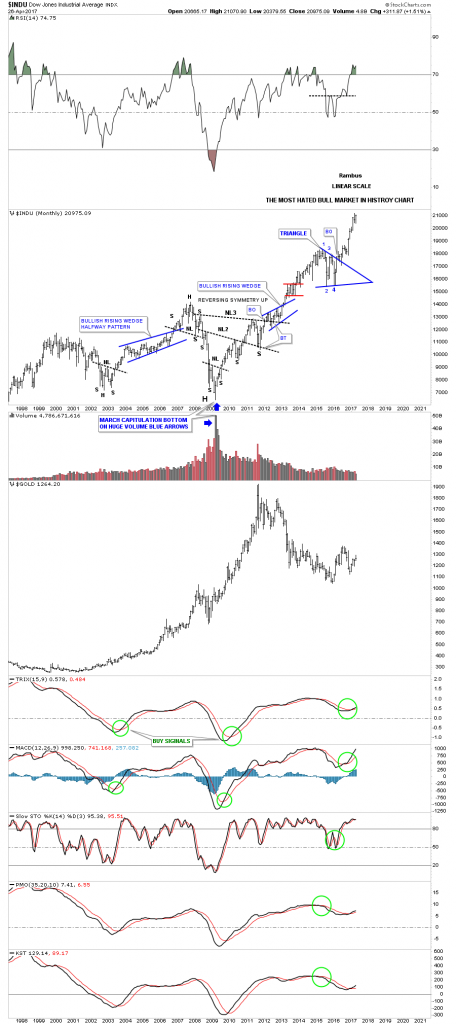
We’ve been following this next chart since the day it broke out above the top rail of the “Jaws of Life” pattern back in November of 2013. Little did I know at the time that the backtesting process would take nearly 2 years to complete, but in the end it was worth the wait.
The quarterly line chart shows the beautiful Jaws of Life consolidation pattern with a perfect breakout and backtest to the top rail.
![]()
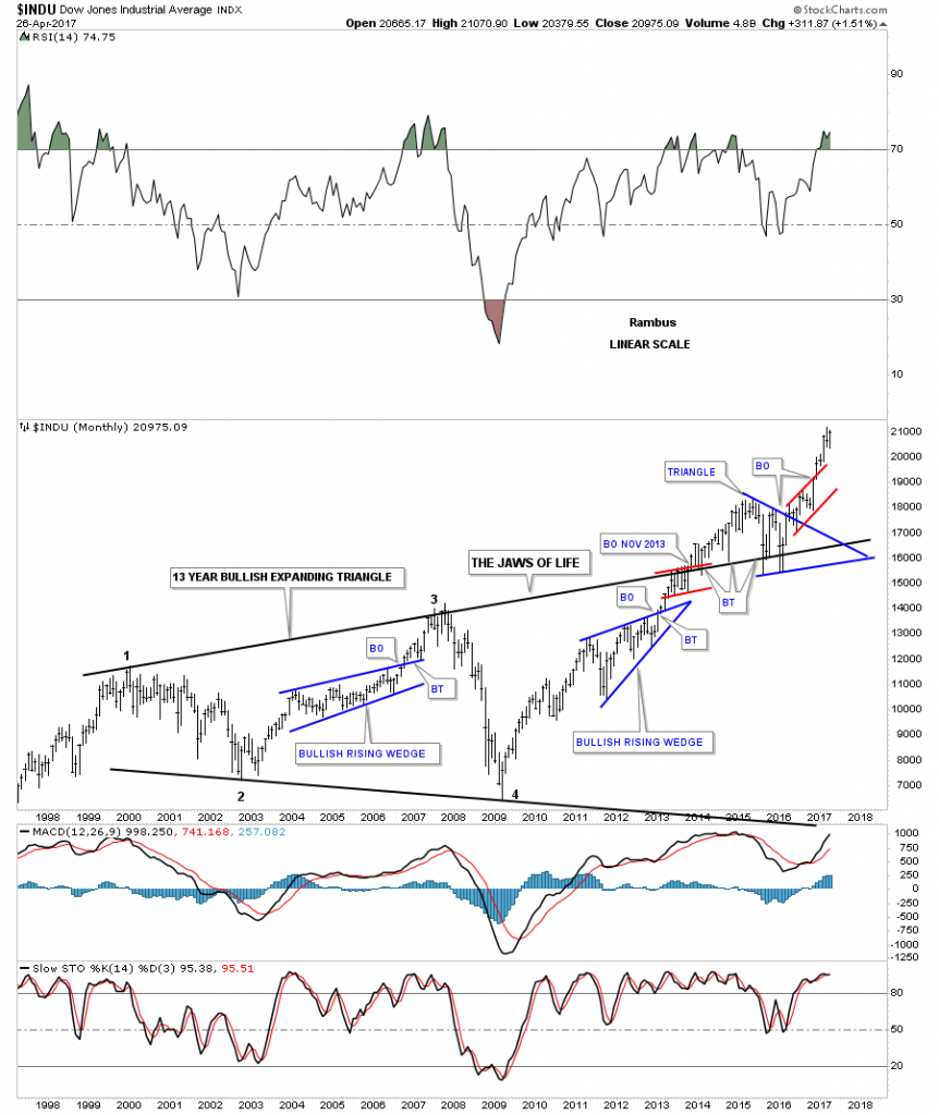
To understand what is really taking place right now in the big picture, this 75 year chart for the INDU puts everything in perspective and is probably the most important chart to view. Very few investors on the planet can even grasp what a chart like this is saying let alone let alone invest their hard earned money in what it’s saying. Keep in mind we’ve been following this Jaws of Life consolidation pattern actually before the INDU finally broke out in October of 2013. Compare the breaking out and backtesting process of our current Jaws of Life to the massive H&S consolidation pattern of the 1970. We are currently in the early stage of an impulse leg up which takes place after a consolidation pattern is finally matured.
![]()


Leave A Comment