
Those that follow my personal account on Twitter will be familiar with my weekly S&P 500 #ChartStorm in which I pick out 10 charts on the S&P 500 to tweet. Typically I’ll pick a couple of themes and hammer them home with the charts, but sometimes it’s just a selection of charts that will add to your perspective and help inform your own view – whether its bearish, bullish, or something else.
The purpose of this note is to add some extra context beyond the 140 characters of Twitter. It’s worth noting that the aim of the #ChartStorm isn’t necessarily to arrive at a certain view but to highlight charts and themes worth paying attention to.
1. The Trendline and the Moving Average (again): For the third week in a row is the infamous trend-line and moving average (200-day) chart. Again you could forget the moving average and draw a line around the 2575 mark, but the key point is you have some clear lines of support and resistance, and a breakout looks imminent. Again, the direction it breaks will likely set the tone for the subsequent major move, so it’s a case of not trying to impose your view on the market but waiting patiently for the break, and listening to what price has to tell us.
Bottom line: The S&P 500 is yet to break either way.

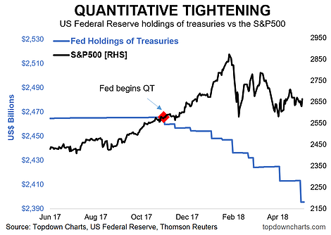
2. Quantitative Tightening vs the S&P500: One chart on the bearish side that might take some by surprise is the quantitative tightening vs S&P 500 chart. The Fed kicked off passive QT last year, initiating its plan to progressively increase the pace at which it ceases reinvesting principal from maturing bonds (so reducing its balance sheet and reducing purchases). Already the reduction in holdings of treasuries has been US$70B, and all going to schedule that number could rise to $280B by the end of the year, as is scheduled to raise the pace of QT to $50B per month by October ($30B in Treasuries and $20B in ABS). Anyway, if you thought quantitative easing was a tailwind for stocks on the way up it stands to reason that it will be a headwind on the way down. So this will be one to watch and a risk to be mindful of.
Bottom line: Quantitative Tightening is well underway, and a likely headwind for stocks.
3. Positive Earnings Surprises: Back onto the bullish side, this chart, shared by Liz Ann Sonders of Charles Schwab shows companies are beating earnings estimates by a record pace. I find this one interesting, because as we know (the next two charts show) earnings estimates have been surging, so it seems that companies are actually beating against progressively higher expectations. I guess the issue with this is that people may begin to ratchet up their expectations as a response, which could set the path towards disappointment against progressively higher expectations. But for now, on the earnings side, things look pretty decent.


Leave A Comment