Those who follow my personal account on Twitter will be familiar with my weekly S&P 500 #ChartStorm in which I pick out 10 charts on the S&P 500 to tweet. Typically I’ll pick a couple of themes and hammer them home with the charts, but sometimes it’s just a selection of charts that will add to your perspective and help inform your own view – whether its bearish, bullish, or something else!
The purpose of this note is to add some extra context beyond the 140 characters of Twitter. It’s worth noting that the aim of the #ChartStorm isn’t necessarily to arrive at a certain view but to highlight charts and themes worth paying attention to.
So here’s the another S&P 500 #ChartStorm write-up!
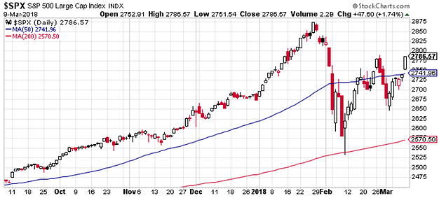
1. The 50-day Moving Average: First up is a quick snapshot of the index, which shows Friday’s close comfortably clearing the 50-day moving average. For simple trend following systems this is going to mean risk-on, and will likely see follow-through buying come Monday, all else equal.It also appears to show the completion of the so-called “W-shaped recovery” (vs V-shaped recovery), expected by many.So a couple of promising signs here.
Bottom line: The S&P500 closed above its 50-day moving average on Friday.

2. 50-day Moving Average Breadth: Looking at the individual components of the index, there’s still only just over 50% trading above their respective 50-day moving averages (52.79 according to Index Indicators).So it certainly raises questions around whether we see broader participation in the rally, or just the heavy weights doing all the heavy lifting, and on that matter we turn to the next chart.
Bottom line: Only 52.79% of S&P500 companies are trading above their respective 50-day moving averages.

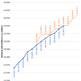
3. The Equal-Weighted S&P500 vs the Cap-Weighted S&P500: This interesting chart from J.C. Parets of All Star Charts shows the relative performance of the equal-weighted vs market cap weighted versions of the S&P500 – basically if the cap-weighted is outperforming it means it’s mostly the heavy weight stocks that are driving returns. So again this goes to the question of whether we see more representation from the small and mid cap stocks as the market recovery plays through.2017 was mostly a story of the heavy weights leading the charge, particularly as small caps lagged, given the setup in the chart, we could be at a turning point on this one.


Leave A Comment