
Precious metals flows data, delivered by popular gold/silver ETFs, can be very misleading. For example, look at these two charts:
iShares Gold Trust (IAU)
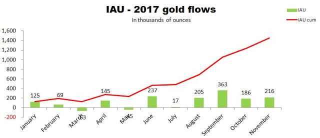
Source: Simple Digressions and the IAU data
The chart shows gold flows reported by IAU. The red line depicts cumulative flows calculated for the period January 1 – November 27, 2017. It is easy to spot that as many as 1.5 million ounces of gold have been added to IAU vaults this year so far.
Now look at this chart:
iShares Silver Trust (SLV)
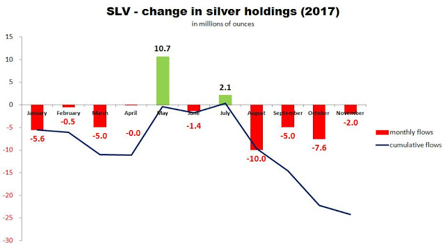
Source: Simple Digressions and the SLV data
SLV is the world’s largest private holder of silver bullion. However, this year this giant recorded a cumulative outflow of 24.2 million ounces of silver.
Now the question is: are we in a bull market or a bear market in precious metals? Or maybe this question is badly-formulated?


Leave A Comment