
When it comes to Biotech ETF’s, performance over the past year has varied greatly. The chart below looks at IBB and XBI, both Biotech ETF’s. As you can see XBI is doing much better in 2015 than IBB, up almost 100% more!

CLICK ON CHART TO ENLARGE
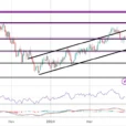
Below looks at the patterns in IBB and XBI, which do have different patterns to say the least!

CLICK ON CHART TO ENLARGE
The chart of IBB on the left reflects a 4-year rising support line was broken and kissed as resistance at the red arrow above.
XBI on the other had, remains well inside of a 4-year rising channel.
Joe Friday just the facts….These Biotech ETF’s are not built the same and the leading performer of the two, remains inside of this rising channel. I would become concerned for this sector and the broad markets if XBI breaks below support!


Leave A Comment