There are so many different areas and charts to look at tonight it’s hard to know where to begin. The precious metals complex had a good week, the stock markets are still slowing rising and I’m seeing some reversal patterns completing on some of the basic material stocks. The question is, is this really just a counter trend rally taking place or is there something more happening behind the scene?
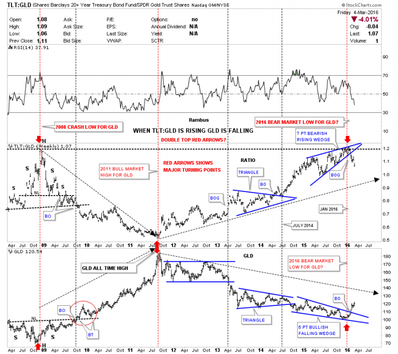
Lets start with a combo ratio chart that has the TLT:GLD ratio chart on top and GLD on the bottom. I posted this chart several times in the last couple of months looking for a direction in gold. I explained in detail a couple of weeks ago about the inverse relationship this combo chart shows so I won’t go into that again right here. The main thing to understand about his ratio chart is that when the TLT is under performing gold the ratio should be falling meaning GLD is stronger. Just a short six weeks ago the price action was still trading inside the blue rising wedge and had not shown its hand yet on which way the rising wedge was going to break. As you can see, the blue rising wedge finally broke to the downside five weeks ago, which told me gold was most likely going to rally and because the blue rising wedge is pretty big the rally in gold should also be pretty big. The bottom chart which has GLD on it is matching the ratio chart on top inversely by breaking up and out of its bullish falling wedge. The red arrows shows you the major inflection points going back to the 2008 crash low. So far this combo chart has been spot on in signaling the potential bear market bottom in gold.
Note: Click on images/charts to enlarge

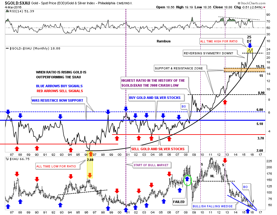
Below is another combo ratio chart we’ve been following which has the Gold:XAU ratio chart on top and XAU on the bottom. The ratio chart on top shows the massive divergence between gold and the XAU. When the ratio is rising, gold is out performing the XAU,which it has been doing since 1996 as shown by the parabolic arc. The last time we looked at this combo chart the ratio chart on top was breaking down from the double top reversal pattern which was the all time high for this ratio. This month is still very young yet but last week the ratio chart on top closed right on the parabolic arc. If the ratio can break below that parabolic arc that would be another very big clue that gold has truly bottomed and the new bull market is well underway. Note the blue bullish falling wedge on the bottom chart which shows the XAU has broken out to the upside. So far this is exactly what we want to see happen.
This next chart is a weekly bar chart for the GLD:XAU ratio chart we just looked at above. This bar chart shows more detail of how GLD has been outperforming the XAU since the 2008 crash low. It was hard to get bullish on the PM stocks when this ratio looked like it did. This is what your typical bull market looks like when you see one consolidation pattern form on top of the next.


Leave A Comment