
We’ve discussed the meaning of the 10-year bond yield at length in a couple articles. For almost this entire bull market, the point that low yields are causing stocks to go up has been repeated endlessly. That call didn’t matter much when yields were going down because it simply implied investors should ride the wave. However, when yields started to rise, it created a controversy as some investors went bearish. The market correction in February was used to support this logic. It’s a major call to say rising yields will cause stocks to fall because yields have been rising steadily on increased growth and inflation expectations. It’s the equivalent of saying the bull run is over because the economy has gotten ‘too hot.’
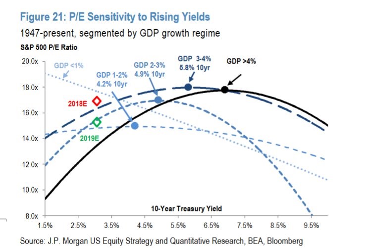
We showed analysis which reported that the average market usually starts to get negatively impacted by rates when the 10-year yield hits 5%. Then we showed how sensitivity analysis pushed the magic number down to 3.5%. Next, we made the realization that the bond market has been in a few regimes so it’s wrong to average out each situation. Sometimes rising yields are bad and other times they aren’t. This long trek to find the true meaning of the 10-year bond yield has led us to the most important analytical chart in macroeconomics and finance. While data is cheaper than ever, some charts still go above the call of duty by providing analysis which makes them unique. The chart below is a thing of beauty.
Higher Yields Shouldn’t Be A Death Knell For Stocks
The Market’s Sensitivity To Yields Depends On Economic Growth
The chart shows how sensitive the P/E multiple is to rising yields. As we know, the 10-year yield has had different effects on multiples throughout history. This chart graphs the sensitivity of the stock market to the 10-year yield by looking at a few GDP growth regimes. The sensitivity depends on how fast the economy is growing. As you can see, there are curves which show each GDP growth regime’s sensitivity to rates.


Leave A Comment