
The GLD ETF that tracks the yellow metal is now up 13% year-to-date after breaking out of a sideways range yesterday. Check out the chart for GLD below.

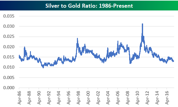
We like to look at gold price ratios compared to other metals, and below we’ve charted the historical silver-to-gold ratio and platinum-to-gold ratio. When the line is rising in the charts below, it means gold is underperforming the other metal. When the line is falling, it means gold is outperforming.
As you can see, both silver and platinum have been underperforming gold for years now. The silver-to-gold ratio is right at the bottom of its 30-year range, while the platinum-to-gold ratio has been making new multi-decade lows for the last two years. Remember when platinum was considered more precious than gold? Even though platinum is 30x as rare as gold, it currently trades at just 75% of the price of gold. At multiple points in the mid-2000s, platinum traded close to 2.5x the price of gold. Given that platinum has more uses than gold in the industrial economy, you definitely wouldn’t expect the ratio to be at record lows multiple years into the current economic expansion. At least based on its historical average ratio of 1.34x the price of gold, platinum looks cheap to us on a relative basis. Unfortunately it has looked cheap for quite some time now!

For those interested, below is a chart of the S&P 500 to gold ratio. Throughout the entire equity bull market that we’ve been in since 2009, this ratio hasn’t been able to break solidly above 2x. At the end of the Dot Com bubble back in early 2000, this ratio was over 5.5x!


Leave A Comment