
Now that we can stop focusing on the imminent destruction of wealth in the stock market, for at least today (I am underwhelmed at the rebound on light volume), we can get back to something that matters: inflation.
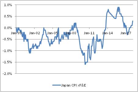
The chart below shows a straight, unweighted average of core or median inflation in the US, Europe, Japan, the UK, and China. (The chart looks similar if we only include the US, Europe, and China and exclude the recent ‘outlier’ Japan and UK experiences).

We know that, in the US, measured inflation is going to be rising at least until the summer, as the one-offs from 2017 drop out of the data. The prior decline, and the current rise, obscure the underlying trend…which is for steady acceleration in prices. But it’s important to realize that this is not merely a US trend, caused supposedly by ‘tight labor markets’ or somesuch. It is a much broader phenomenon. The chart below shows four of those five countries.

In the US, inflation has been rising steadily (other than that one-off burp caused by cell phones etc) since 2013. In the UK, China, and Europe, inflation has been rising since ~2015, to lesser or greater degree. In the UK, core inflation is showing some signs of topping as the Brexit-related spike fades, and the trend is less convincing in Europe so far. In Japan (see below), inflation has been rising since 2010, but the tax-induced spike in 2014 has messed up the steadiness of the trend. And of course, it is worth pointing out that 0.3% is only high relative to the average of -0.3% since 1999!
I point out these trends because inflation is less of a concern if it happens in one country than if it happens as part of a global inflation process. Imagine that inflation is represented by the proportion of the sand on a beach that is wet rather than dry. There are two ways that sand can get wet: because of random wave action that comes and goes, or because the tide is coming in.


Leave A Comment