
Most advice on long-term planning for retirement and Social Security benefits is based on the assumption that Social Security will fully keep up with inflation. As we are establishing in this series of analyses, the full inflation indexing of Social Security is a myth and there are major implications for the standard of living in retirement as well as the associated decisions with regard to both Social Security and investment planning.
In this second analysis, we will use the actual historical data as reported by the Bureau of Labor Statistics and the Social Security Administration in recent years, instead of using long-term average inflation rates as we did in Part 1. Analysis of that data shows that the purported very low rates of inflation have been producing the equivalent of a one-week bonus check for retirees each year, due to the reduction of inflation lag costs.
However, the index and methodology being used by the Social Security Administration have been producing smaller benefit increases than what the government itself has been saying is average inflation. This index mismatch, in combination with inflation lags is currently producing a steadily decreasing standard of living for retirees dependent on Social Security.
As we will explore, if what has been happening from 2015 through the current date continues into the future, then the average Social Security recipient will effectively lose a week of purchasing power roughly every four years. For someone who needs every dollar of 12 full months of income to pay 12 full months of retirement expenses, then this partial inflation indexing means that by 2024 the money will effectively be running out by December 12th, leaving the average retiree with an almost three week income shortfall.
Part One Of The Series
This analysis builds upon the Part 1 analysis, which is linked here. What was developed in Part 1 was the concept of the “Social Security Inflation Lag Calendar” as shown below.

Assuming level and historically average inflation we have two lags that occur each year, each of which reduces the standard of living of retirees.
The first lag is the inflation that occurs between when the inflation index is measured (the light blue bars above) and the first monthly payment in January of the following year (the red bars).
On top of that, there is a steady decline in the purchasing power of each payment over the course of the year, which with historically average inflation would mean that by the December payment the purchasing power of that benefit would only be worth about 95 cents on the dollar. This means that about a five percent reduction in purchasing power needs to be covered by the fixed income retiree in some manner.
Recent History & A One Week Bonus Check
In recent years the government has been reporting much lower rates of inflation than what we’ve seen over the long term.
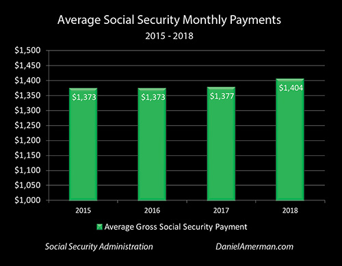
The graph above shows our actual historic benefit increases between 2015 and 2018 for someone who is receiving the average 2017 Social Security monthly benefit.
Payments have risen from $1,373 in 2015 to an average of $1,404 in 2018. On a smoothed basis if we look at the growth rate that it takes to go from $1,373 to $1,404 in that time, Social Security benefits have been rising at an average annual rate of 0.75%.
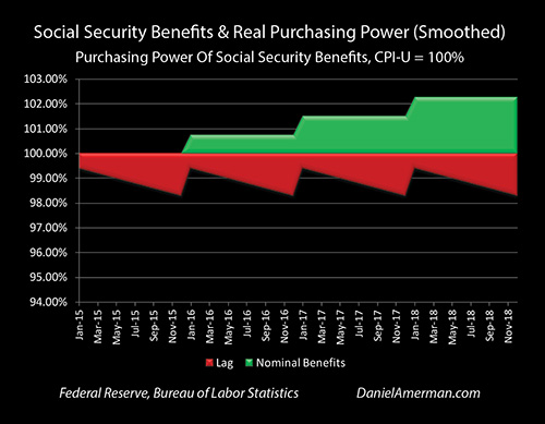
This rate of increase in Social Security benefits can be seen in the green “steps” in the graph, with benefits rising at 0.75% per year on a smoothed basis. (This type of graph was developed in Part 1 of this analysis, and while somewhat unusual, is a particularly accurate look at how Social Security purchasing power really works on average.)
Inflation, as reported by the government, has been about 1.216% per year. More specifically, in this case we’re looking at inflation as being the widely reported Consumer Price Index for All Urban Consumers (CPI-U) as measured on September first of each year, which corresponds to the end of the annual Social Security index measurement period.


Leave A Comment