Note: With yesterday’s release of the Federal Reserve’s Z.1. Financial Accounts of the United States for Q4 2017, we have updated this commentary to incorporate the latest data.
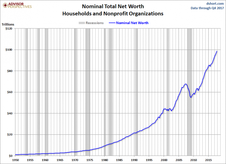
Let’s take a long-term view of household net worth from the latest Z.1 release. A quick glance at the complete data series shows a distinct bubble in net worth that peaked in Q4 2007 with a trough in Q1 2009, the same quarter the stock market bottomed. The latest Fed balance sheet shows a total net worth at an all-time high — 76.7% above the 2009 trough. The nominal Q4 net worth is up 2.1% from the previous quarter and up 7.8% year-over-year.

But there are problems with this analysis. Over the six decades of this data series, total net worth has grown about 9100%. A linear vertical scale on the chart above is misleading because it fails to provide an accurate visual illustration of growth over time. It also gives an exaggerated dimension to the bubble that began in 2002.
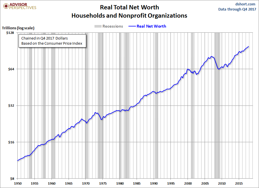
But there is another more serious problem, one that has to do with the data itself rather than the method of display. Over the same time frame that net worth grew over eight-thousand plus percent, the value of the 1950 dollar shrank to about nine and a half cents. The Federal Reserve gives us the nominal value of total net worth, which is significantly skewed by money illusion. Here is a log scale chart adjusted for inflation using the Consumer Price Index.
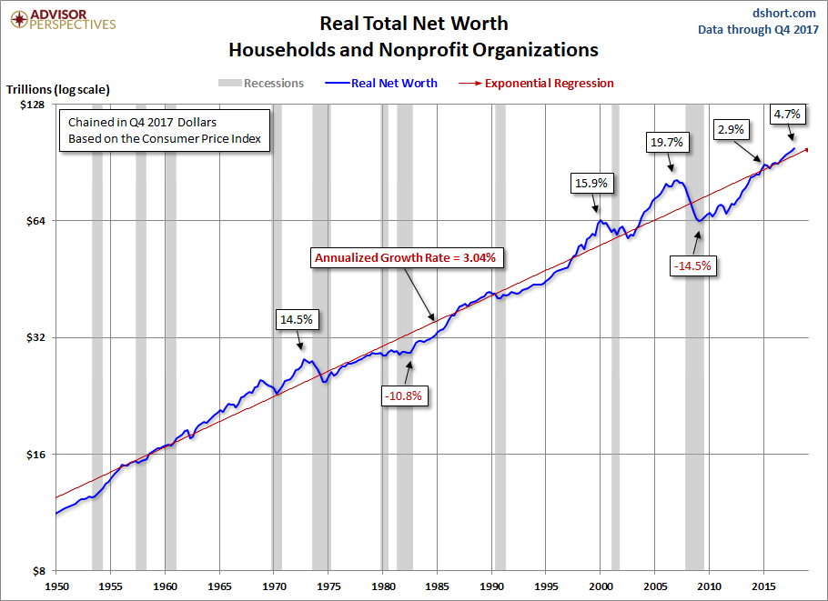
Here is the same chart with an exponential regression through the data. The regression helps us see the twin wealth bubbles peaking in Q1 2000 and Q1 2007, the Tech and Real Estate bubbles. The trough in real household net worth was in Q1 2009. The recovery from that trough took us above the regression early last year. This indicator is now 4.7% above trend. The annualized growth rate over this time frame is 3.03%.
Net Worth Per Capita


Leave A Comment