See times of the year when the stock market (S&P 500) tends to do well and poorly, based on long-term historical tendencies. These tendencies may aid in making buy or sell decisions.
Typically, we look at price charts chronologically, one day follows the next and each month follows the prior in sequence. Chronological charts show an asset’s price path over time and provide a lot of information to technical traders. Such charts reveal trends and support and resistance areas, for example. Yet, we can also look at an S&P 500 seasonal chart to gain insight into stock market information not readily available on chronological charts.
A seasonal chart of the S&P 500 shows when the index (or S&P futures) tends to move higher and lower, or peak or bottom, at certain points in the year.
Instead of looking at the last 20 years of S&P 500 data in chronological order, what if you took each one year period, January to December, and printed it on a transparent slide. Then, stack all those transparent slides on top of each other. Doing this would highlight any period of the year which tends to be strong or weak. Luckily, we don’t need to do that. We can just take an average of the last 15 or 20 years to reveal whether there is a tendency to rise or fall at different times of the year (also see EURUSD Seasonal Patterns).
Below we look at seasonal patterns for the S&P 500 futures and S&P 500 Index.
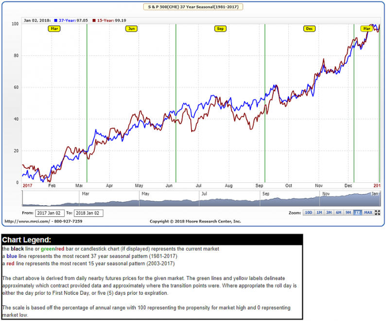
Stock Market Seasonal Patterns
The stock market has seasonal tendencies, and we can see them by looking at the following seasonal chart of S&P 500 futures.
S&P 500 Futures Seasonal Chart- 15 and 37 Year

Source: MRCI.com
The chart shows how the price tends to move at different times of the year.


Leave A Comment