
Well, I jinxed it.
In this past weekend’s missive I wrote:
“There are generally two events that happen every year – somebody forgets their coat, goggles or some other article of clothing needed for skiing, and someone visits the emergency clinic with a minor injury.”
The tradition continues as my wife fell and tore her ACL. The good news is she tore the right one three years ago, and after surgery is stronger than ever. Now she will get to do the left one.
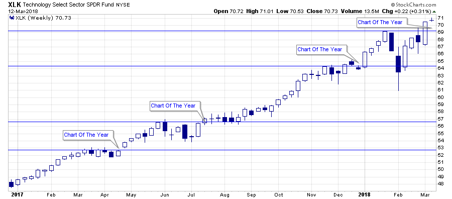
But, while I was sitting in the emergency clinic waiting for the x-rays to be completed, I was sent a chart of the technology sector with a simple note: “Chart Of The Year.”
Chart Of The Year
Yes, the technology sector has broken out to an all-time high. Yes, given the sector comprises roughly 25% of the S&P 500, it suggests that momentum is alive and well keeping the “bullish bias” intact. (We removed our hedges last week on the breakout of the market above the 50-dma on a weekly basis.)
This is why we are currently only slightly underweight technology within our portfolio allocation models as shown below.

But why “the chart of the year” now? As shown below the technology sector has broken out to all-time highs several times over the last 18-months. What makes this one so special?
The Last Breakout
As stated, breakouts are indeed bullish and suggest higher prices in the short-term. This time is likely no different. However, breakouts to new highs are not ALWAYS as bullish as they seem in the heat of the moment. A quick glance at history shows there is always a “last” break out of every advance.
1999-2000

2007-2008

As I discussed yesterday, the technology sector is once again the darling of “Wall Street” just as it was at the peak of the previous two bull-markets.


Leave A Comment