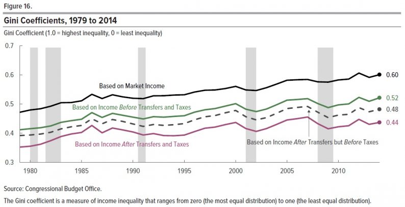
The Congressional Budget Office has published the latest version of its occasional report on “The Distribution of Household Income, 2014” (March 2018). It’s an OK place to start for a fact-based discussion of the subject. Here is one figure in particular that caught my eye.
The vertical axis of the figure is a Gini coefficient, which is a common way of summarizing the extent of inequality in a single number. A coefficient of 1 would mean that one person owned everything. A coefficient of zero would mean complete equality of incomes.
In this figure, the top line shows the Gini coefficient based on market income, rising over time.
The green line shows the Gini coefficient when social insurance benefits are included: Social Security, the value of Medicare benefits, unemployment insurance, and worker’s compensation. Inequality is lower with such benefits taken into account, but still rising. It’s worth remembering that almost all of this change is due to Social Security and Medicare, which is to say that it is a reduction in inequality because of benefits aimed at the elderly.
The dashed line then adds a reduction in inequality due to means-tested transfers. As the report notes, the largest of these programs are “Medicaid and the Children’s Health Insurance Program (measured as the average cost to the government of providing those benefits); the Supplemental Nutrition Assistance Program (formerly known as the Food Stamp program); and Supplemental Security Income.” What many people think of as “welfare,” which used to be called Aid to Families with Dependent Children (AFDC) but for some years now has been called Temporary Assistance to Needy Families (TANF), is included here, but it’s smaller than the programs just named.
Finally, the bottom purple line also includes the reduction in inequality due to federal taxes, which here includes not just income taxes, but also payroll taxes, corporate taxes, and excise taxes.


Leave A Comment