
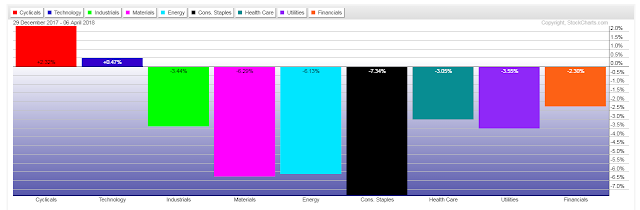
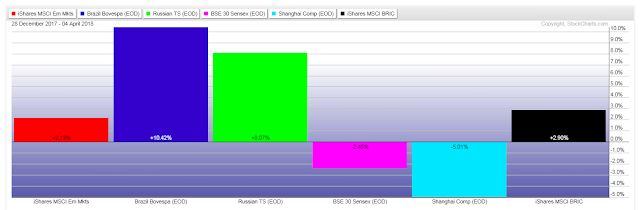
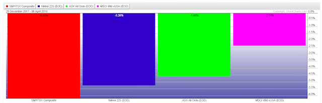
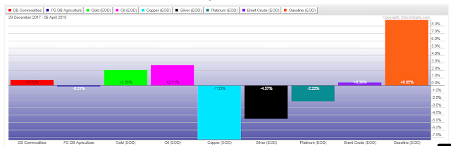
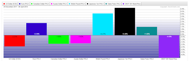
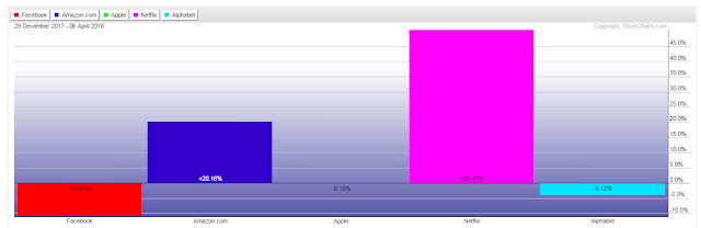
The following year-to-date graphs show, at a glance, which global indices, US sectors, commodities, currencies, bonds, as well as the FAANGs, have gained/lost the most, so far.
My only comment is keep an eye on the Canadian and Aussie Dollars, as well as China, Canada and Australia, in particular, further weakness could hint of a recession in the not too-distant future.


Leave A Comment