
Two days before the February 5 volmageddon, and before everyone became an overnight expert on inverse VIX ETFs, CTAs an risk-parity funds, we showed two charts which we explicitly said presaged a turning point for markets, vol-targeting funds, and hinted at an imminent risk-parity tantrum.
The first showed the unmistakable correlation shift between 10Y yields and the S&P, which we said is “considerably worrisome for investors.”
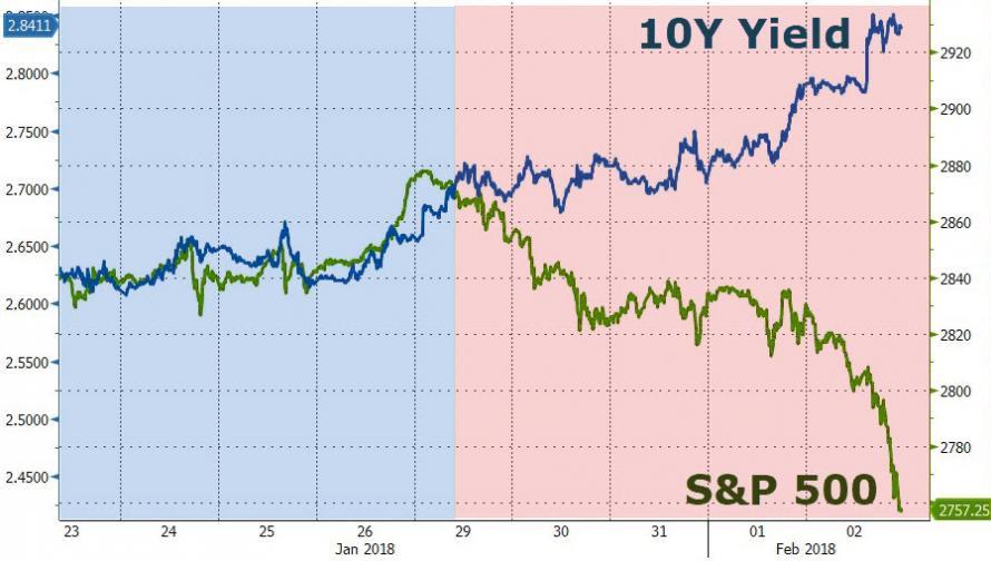
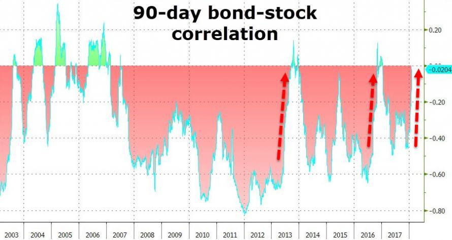
Meanwhile, we also showed that the bond-equity correlation, which has been predominantly negative since the Lehman crisis, had started creeping up towards positive territory. Specifically, we said that “the 90-day correlation between stock (SPY) and bond (TLT) markets has surged ominously in the last few weeks.”
Three weeks later, Bank of America – in response to “many interest rate questions from investors” – published a 50-page report which looks at the relationship between rising rates and stocks to conclude, after tortured and convoluted logic and several goal-seeked examples, that rising rates are not bad for stocks.
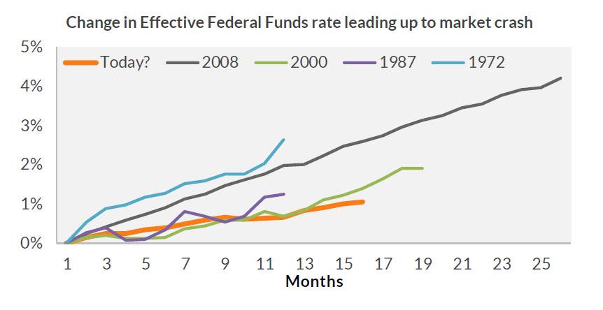
Actually, they are, and here is the simplest reason why in just 9 words: “Every market crash has been preceded by Fed tightening.”
Still, BofA did have some interesting observations on the long-term historical relationship and rolling 3-year correlation between the S&P and 10Y yields, to wit:
Over the past 64 years, stocks have exhibited a weak and inconsistent correlation with interest rates (-11%).

Over this period, the correlation has seen a wide range from -63% to 75%. The relationship was generally negative for most of the 1960s through the 1990s (higher yields bad for stocks), a period during which the average level of rates was 7.5%. But since the turn of the century, the relationship was generally positive (higher yields good for stocks) a period during which the average level of rates was 3%. The relationship with rates and stock returns peaked about five years ago, but has remained positive and has been trending higher since the recent trough of 13% in late 2015 (Chart 2).


Leave A Comment