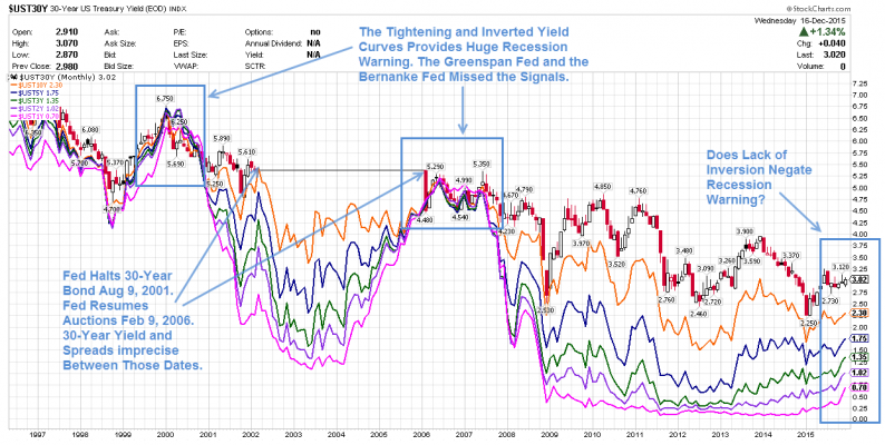
Inquiring minds may be interested in a detailed look at the yield curve and spreads between various durations following the Fed’s Wednesday rate hike. Let’s start with a long-term chart from 1996 to 2015.
Yield Curve 1996-Present

Click on any chart for much sharper image
Legend
Notes
Spotlight on Spreads and Inversions
It is very difficult to see spreads and inversions over such a long duration in the above chart. There are simply too many data points.
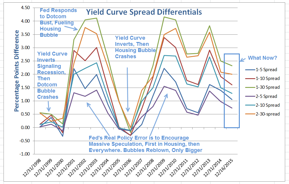
For ease in viewing, I took year-end closing numbers (except the current year which is as of close on December 16, the day of the hike), and plotted them in Excel.
Yield Curve 1998-2015 (Year-End Values)

Yield Curve Differentials 1998-2015 (Year-End Values)


Leave A Comment