
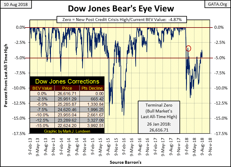
The stock market is in its dog-days of summer; for the past month the Dow Jones didn’t want to go up yet refuses to go down. Since July 16th (twenty trading days) the Dow Jones has remained in a tight trading range in the BEV chart below, from -3.71% down to -5.91%.
Comparing the low volatility of the past twenty trading sessions with the other similar periods in the BEV chart below shows the past twenty trading days as something unusual but not really rare. If the past is any guide, and it usually is, when the Dow Jones finally breaks out of its current quiescent state of trading we should see some excitement. Whether that’s to be a break out above its BEV -2.5% line or a decline below its -7.5% line is something we’ll just have to wait and see.
I still haven’t given up on the Dow Jones making a new all-time high. But from its close of today that would only be a gain of 4.87% in a market that I believe is at risk of declines of greater than 40% sometime in the next year. After a nine year, 21,000 point advance in the Dow Jones, buying shares now in the broad market is buying at the top of the market. In August of 2018 that’s just a fact, and buying at a market top is something I’m not going to recommend my readers do.
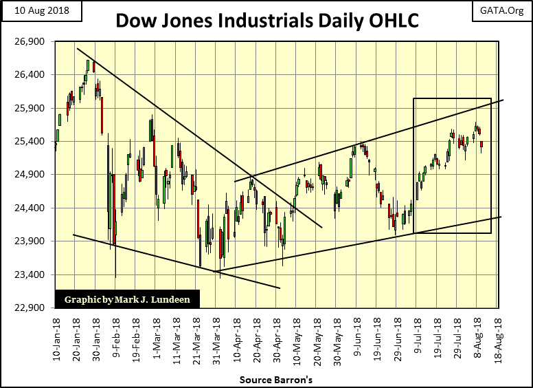
Looking at the daily bars below, the Dow Jones began the week well enough, but after Tuesday began leaking air. What this market needs is an “injection of liquidity” large enough to drive the Dow Jones up above its 25,900 line with authority. But will it get it?
Your guess is as good as mine. What isn’t conjecture is the Dow Jones isn’t going to remain in its current state of suspended animation forever. Somewhere ahead of us is a week or two of big daily moves that is going to put an end to this boring market action and most likely will show us the direction of the next big thing in the market.
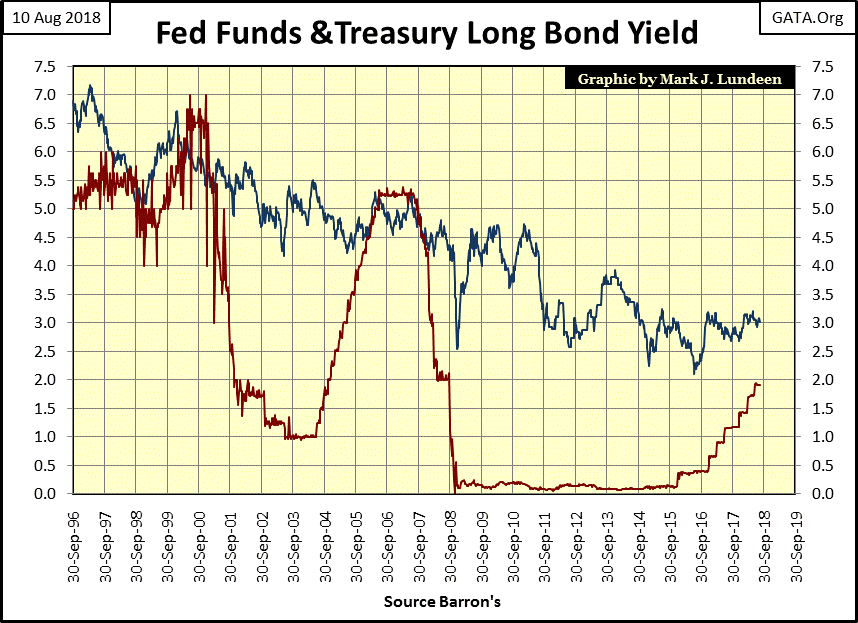
That interest rates and bond yields will be key to what the stock market’s next big move will be remains a logical assumption. In late 1999, seeing the Fed Funds Rate (Red Plot) rise above the long T-bond yield (Blue Plot), and again in 2006 signaled the end of a bull market in stocks It won’t be any different this time when the FOMC once again inverts their Fed Funds Rate over the long T-bond yield.
Last week I wondered how bond yields could be so low in a world groaning with the burdens of debt it now carries. Look at the chart below. Why did T-bond yields peak at over 15% in October 1981? Annual double-digit percentage increases in consumer prices were one factor. But seeing the US National Debt increase from an alarming $296 bil in January 1962, to a shocking $1 trillion in October 1981 was a big factor too. Back in 1981, people were wondering how the US Treasury was going to repay all that money?

Related Posts
 E
EUR/AUD Is Trading Bullish – Elliott Wave Analysis
E
EUR/AUD Is Trading Bullish – Elliott Wave Analysis- China Is Still The Long-Term Play Of The Century – For Those Who Make This Smart Investment
 ECB Rate-Cut Odds Tumble As EU Inflation Re-Accelerates In December
 Emerging Markets: Week Ahead Preview – Dec. 11
 The Anti-Perfect Jobs Condition
- Beware The German “Hump”
Leave A Comment