
Record Highs On Tuesday
The stock market played to this year’s theme on Tuesday as the S&P 500 hit 2,600 for the first time, rallying 0.65%. The Dow had its 60th record high of the year which is 4th most records since 1910. The Russell 2000 rose 1.03% and the VIX fell 8.64% to 9.73. Tech led the market as the S&P 500 tech sector was up 1.16%. The chart below is an elongated historical measurement of advisor sentiment. As you can see, the bullishness was only higher 3 periods in the 1980s. That’s what happens when volatility stays sedated for an entire year.

Lack Of Tech Pulling Down MSCI Europe
Tech didn’t just have a good day, it has had a great year. As you can see in the chart below, the tech sector has had the biggest outperformance gap of any sector since 1999. The sector is the leader of the new economy based on the internet. It is being helped by the low inflation rate. Technology’s outperformance is creating interesting performance gaps. Any index which has a lot of tech is doing well and any index which doesn’t have much tech is underperforming. The most noteworthy index which doesn’t have a lot of tech is the MSCI Europe index which has a less than 5% tech weighting which is below the MSCI World index which has a 17% weighting, the MSCI USA index which has a 25% weighting, and the MSCI Asia index which has a 28% weighting. Many tech stocks in Europe are expensive because investors want to buy tech, but there aren’t many stocks which meet investors’ needs. MSCI Europe underperformed MSCI World from 2013 to 2016. This year MSCI Europe is doing 3.64% better than MSCI World as of October 31st.

Another Ominous Chart
From the report with the comparison of this market to the 1920s, there’s another ominous chart forecasting doom and gloom. The chart shows the two times in history when the economy was ‘perfect.’ The only times the unemployment rate was low, inflation was positive but low, stocks were expensive, real GDP growth was positive, S&P 500 earnings growth was in the double digits, and the 10-year yield was below 4% were 1929 and 2017. The debate is whether the author of this chart tried to find similarities with times before crashes or if the economy just happens to be in the same state as 1929. One big difference between that period and now is that there aren’t world wars sandwiching this bull market. I think this comparison is more representative of how great things are than a bad forecast because these metrics will need to go sour to catalyze a crash.

Related Posts
 5 Quality Dividend ETFs Crushing The Market On Tax Reform
 As Jackson Hole Ends, Here Is The Truth
 UK GDP Beats With 0.5% Q/Q – GBP/USD Remains Bid
 Switzerland’s largest insurer AXA starts accepting Bitcoin as payment
 The Economic Acceleration In Europe Underpins Global Growth
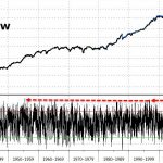 Global Markets Shaken By Sudden Equity Sell-Off: Hang Seng Crashes, VIX Surges


Leave A Comment