
Let’s take a stroll through the interest rate situation, using daily charts instead of the usual bigger picture weeklies a day after Lael Brainard schooled us about the “new normal” (hint, it ain’t normal; it is and has been a Wonderland of possibilities, post-2008). She is either too dim or too guarded to admit the cynicism and desperation behind now institutionalized Fed and global central bank policies.
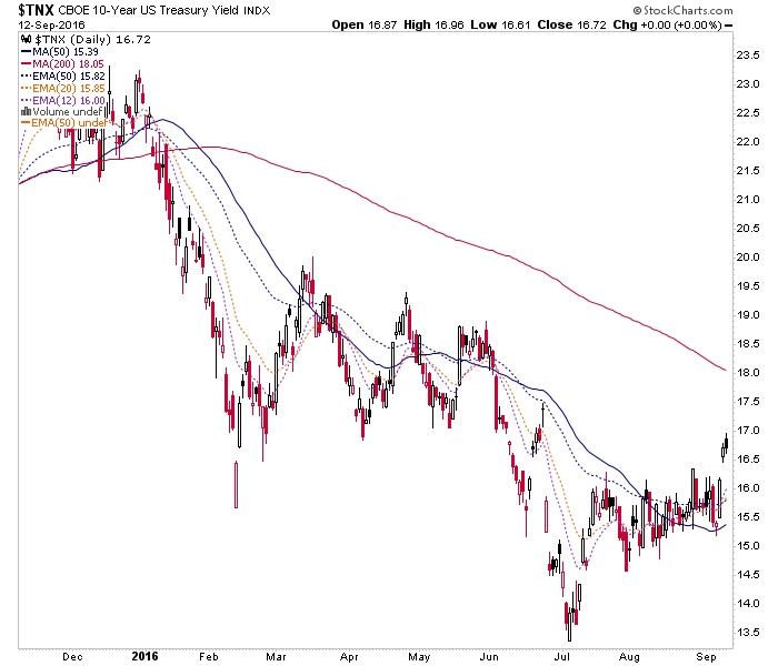
The yield curve has broken through the 50 day averages as it did back in the spring. A rise would have to start somewhere however, and given a raft of economic data this week and FOMC next week, we should know more about its fate by the end of next week.

The nominal 10 year yield is making a move to break out of consolidation. If you were going to re-fi that mortgage, July was the time to do it. I wonder if that plunge, amid the hype and cacophony of NIRP and BREXIT was as good (or bad, as the case may be) as it gets.
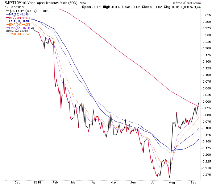
Japan 10 year yields have broken out… all the way up to ZERO%! Alice, meet Wonderland… do you still take the dove Brainard and her Hawk-in-drag counterparts like Bullard, not to mention secondary attention seekers like Rosengren seriously? Kuroda, Yellen, the Draghi… ? They are all the same desperate and wounded animal.
German 10 year, see US 10 year above.

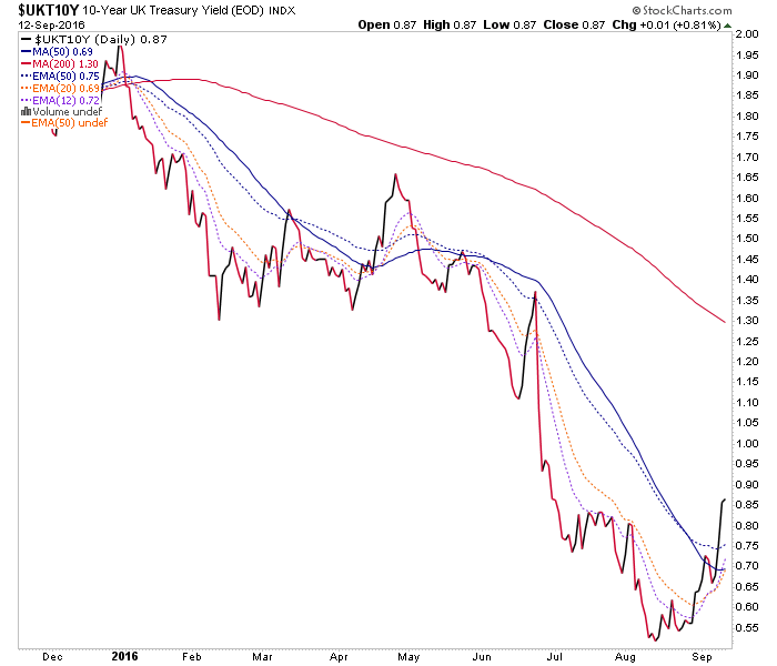
UK 10 year as well, after the world ended during BREXIT except that it didn’t.
Dialing it back to the US, the dynamics appear to be that a hint of forward inflation expectation is presenting in the short-term. That is because the 10 year yield is rising and the ratio of inflation protected vs. unprotected Treasury bonds is also bouncing (as nominal bonds drop, which is also an inflationary signal).

It is fairly comical to watch each FOMC meeting bring anticipation, apprehension and much market reaction leading into each non-event (save for the December token). It is comical to watch them pile out of their clown car and take to the mics in order to max-confuse us. It is comical because we have charts that put the lie to all of this hand wringing about interest rates and would-be hawkish policy.


Leave A Comment