from the Philadelphia Fed
— this post authored by Elif Sen and Adam Scavette
Where you live can determine how far a dollar goes. But pay varies regionally, too. To get a true picture of an area’s affordability, it helps to understand regional price parities.

It’s common knowledge that the cost of living varies drastically across the United States. Housing prices in the San Jose area are the highest for any metro area in the country, while housing can be had in parts of Alabama for nearly one-tenth that. Of course, wages vary, too. Workers in Silicon Valley earn considerably more than those in the Deep South. But do wage differences offset housing costs? Jobhunters considering moving to another city, even one in the same state, need a way to know what prices are like there and whether their pay will be high enough to maintain their desired standard of living. Economists, too, want to be able to compare certain types of economic data across cities and regions, particularly information on consumer spending – a critical category that accounts for nearly 70 percent of the nation’s output – in a way that controls for different regional price levels. How do we get a sense of how prices in a given city or region compare with prices in another or how fast prices are rising in one place versus the next? By creating a basis for comparing an area’s cost of living, we can construct a standard for comparing how much purchasing power its residents have.
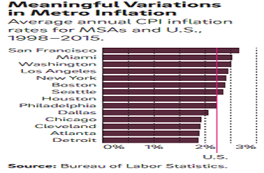
The Bureau of Labor Statistics (BLS) produces the most well-known measure of U.S. prices, the consumer price index (CPI). It tracks how prices change from month to month and year to year for a standard “basket” of consumer goods and services representing major consumption categories such as food, housing, transportation, education, and medical care. Similar price index data are available at the local level, including for 14 major metropolitan statistical areas. Like the nation, these metro areas have experienced overall price growth over time. However, the rate of price increases differs meaningfully from one city to another. While national price inflation averaged 2.2 percent from 1998 through 2015, prices in these 14 metro areas grew at varying rates (Figure 1). The San Francisco and Miami metro areas, for instance, had slightly faster price growth, above 2.5 percent, over those 17 years, while prices in and around Atlanta, Cleveland, Chicago, and Detroit rose less than 2.0 percent a year on average.

Related Posts
 Small Caps & High Yield Corporate Bonds Hint Of Higher Volatility Ahead
 Brexit Is Pandora’s Gift To Britain
 Wheeler Real Estate Investment Trust, Inc. Prices Series D Convertible Preferred Stock Follow-On Offering
 Small Cap Owning Large Cap, Mass Hysteria!
- The True Path To Prosperity
- Pressures On US Economy Just Increased


Leave A Comment