Lockup Expiration: Report Update 2
Below in Chart 1 is an updated top ten list of sample/return period combinations using data for stocks with a post IPO lockup expiration date from January 2013 through mid-October 2015. Additionally, the top ten sample/return period combinations from the original August 2014 lockup report, and those combinations after the December 2014 update, are also shown below in Charts 2 and 3.
Our premium followers received a first look at this research on November 5.
Background Examples
Our results from trading IPO lockup expirations have been extraordinary; as of August 2015, over 60% of the 208 related stocks we’ve shorted proved profitable in a short window of time (approximately two weeks, surrounding the lockup expiration date).
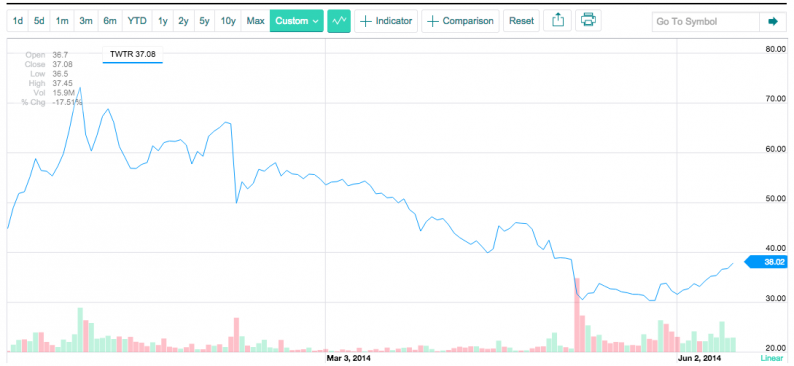
Twitter’s (NYSE:TWTR) lockup expiration illustrates the phenomenon well. Its expiration date of May 6, 2014 (180 days after its November 6, 2013, IPO) reveals a decrease in share price. The downward trend is visible days preceding and following the event, accompanied by greater volume.

(Nasdaq.com)
More recently, Solaredge (NASDAQ:SEDG) delivered abnormal negative returns of over 7% in a two-week window, surrounding its lockup expiration.
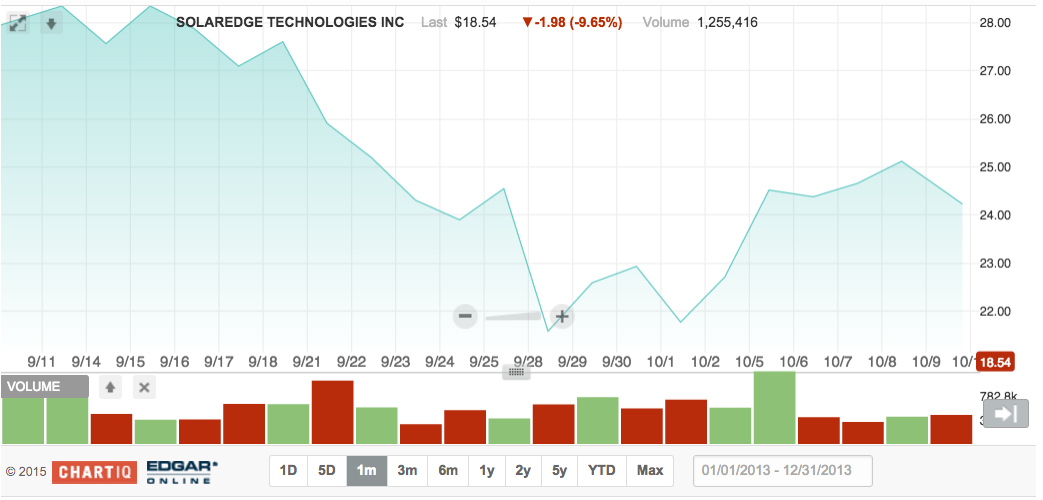
(Nasdaq.com)
Next up, we’re closely watching Shopify (NYSE:SHOP). Its lockup expiration is set to occur on November 23rd.
We encourage our readers to contribute your thoughts to our new research below.
New observations include:
The total sample size has increased from 345 to 555 stocks.
The sample with the most negative average returns (tech stocks that did not have a secondary and had positive performance from pricing to day -11) saw returns in the period of days (-11, 9) (day 0 being the event)move from -5.8% to -4.2%, while the number of stocks in the average increased from 73 to 143.
This is notable since it represents a decrease in the size of the abnormally negative returns (although still very worthwhile for trades).
More of the top ten returns are from holding periods for the sample that includes tech stocks that did not have a secondary offering and saw positive stock returns from pricing to day -11.
Also, eliminating stocks that had a secondary did not result in superior average returns, since the overall sample for the (-11,9) period had average returns of -1.7%, while removing stocks with a secondary from the sample resulted in average returns of -1.6%. Thus, it is more likely to be the narrowing of the sample, based on tech industry affiliation and positive gains from pricing to day -11 that resulted in superior returns for these samples.
A relatively short holding period now appears on the top ten average returns list.
Specifically, (-2,0) for tech stocks with no secondary and positive performance from IPO pricing to day -11 had average returns of -2.0%.
Interestingly, as can be seen in Chart 4, most of the negative average returns for (-2,0) occur on day 0.
As can be seen in Chart 5., holding a stock after day 9 on average resulted in minimal further downward movement or even sharp upward movement until day 12, the last day for which data was collected.


Leave A Comment