

Last week, I addressed some interesting stats from Adam Taggart via Peak Prosperity:
Or visually:

A week later, and nothing has changed with markets once again registering “all-time” highs.
As I have shown previously, the seemingly “impervious” advance since the election last November, has had an interesting “stair step” pattern with each advance commencing from a breakout of a several month 3%-ish consolidation range. Furthermore, each advance then pushes to a 3-standard deviation extreme, black circles, of the 50-dma before beginning the next consolidation trading range.

Notice that in both charts above, the market is currently pushing 3-standard deviations above their moving averages. This is an important concept to understand.
You’re Making My Brain Hurt
I know. It’s boring. But stay with me for a moment as this is important to understand.
Standard Deviation is defined as:
“A measure of the dispersion of a set of data from its mean. The more spread apart the data, the higher the deviation. Standard deviation is calculated as the square root of the variance.”
In plain English this means, and as shown in the chart below, is that the further away from the average that an event occurs the more unlikely it becomes. As shown below, out of 1000 occurrences, only three will fall outside of the area of 3 standard deviations. 95.4% of the time events will occur within two standard deviations.

For the stock market, and as shown in both charts above, the standard deviation is measured is with Bollinger Bands. John Bollinger, a famous technical trader, applied the theory of standard deviation to the financial markets.
Because standard deviation is a measure of volatility, Bollinger created a set of bands that would adjust themselves to the current market conditions. When the markets become more volatile, the bands widen (move further away from the average), and during less volatile periods, the bands contract (move closer to the average).
The closer the prices move to the upper band, the more overbought the market, and the closer the prices move to the lower band, the more oversold the market.
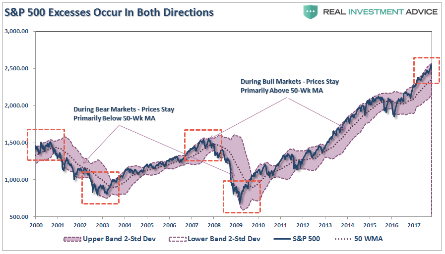
The dashed purple line is the 50-week moving average (or mean) with shaded area representing 2-standard deviations. As shown in the chart above, 2-standard deviations encompass 95.4% of all probable price movement. Even during the 2012-15, QE3 driven, stock advance, there were several corrections back to the 50-week moving average which allowed for increases in equity risk.
But, historically speaking, this is also where both intermediate and major peaks have formed. I showed this in detail in last Monday’s chart of the day which showed the S&P 500 based on Dr. Robert Shiller’s inflation adjusted price data and is plotted on a QUARTERLY basis. From that quarterly data I calculated:

As shown above, the extensions of valuation, deviations from extremely long-term means and very high long-term RSI readings are flashing caution signals for investors.
But, as I penned last week:
“Over the next several weeks, or even months, the markets can certainly extend the current deviations from long-term mean even further. But that is the nature of every bull market peak, and bubble, throughout history as the seeming impervious advance lures the last of the stock market “holdouts” back into the markets.”
Currently, with the index more than 6% above its 50-week moving average, there is little questioning that the markets are extended to the upside. The most likely outcome, at some point, is a “reversion to the mean.”
“Reversion To The Mean” – Is That Really A Thing?
The reality is that all markets eventually “revert to the mean” which is described as:
“Mean reversion is the theory suggesting that prices and returns eventually move back toward the mean or average. This mean or average can be the historical average of the price or return, or another relevant average such as the growth in the economy or the average return of an industry.”

Related Posts
 Emerging Markets: Week Of Aug. 27 Preview
 We Have Never Seen Global Trade Collapse This Dramatically Outside Of A Major Recession
 Decision Time For Nasdaq
- 5 Dividend Stocks To Buy Even If Rates Rise
 As The Fed Meets, Expect Expansion Through 2018, But Problems Thereafter
- Daily Market Analysis Video – December 21, 2015


Leave A Comment