
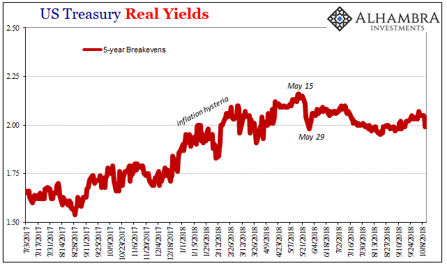
Somehow, the scale of May 29 keeps getting bigger. I should clarify, meaning that the very few data series that can pick up on what happened that day have had trouble picking up on exactly what happened that day. It was, to put it simply, a global collateral call of some undetermined magnitude. We know it was substantial by the earthquake across markets in the real world.
But how substantial?

Apparently, it’s quite hard to figure. Most if not all the data we see is predicated on sampling. Whichever agency or outfit surveys a subset of the population in the area they wish to study, hoping that in the end, it is a large enough sample to pass statistical testing for significance (as well as a whole bunch of other mathematical assignments, such as occasionally heteroskedasticity).
These sample techniques are by nature biased by the past; the data we use to construct them are taken from what really happened before. Thus, when confronted by a large break, there is a tendency to “smooth” the disjunction at least until more data comes in (larger samples).
For May 29, the Treasury Department’s TIC data is practically the only series capable of detecting the seismic collateral shift – just as it did in eurodollar spaces in 2008 when MBS were suddenly repudiated all at once launching the mad deflationary scramble for UST collateral. The first run of estimates, sure enough, perceived something monstrous even if we can’t know from it exactly what the monster was (“other” forms of securities provided by “other” financial institutions around the world).
With the update for August now in hand, released yesterday, the aftershock in June 2018 keeps getting larger. In other words, it was always this large but now we have a better idea (hopefully) the actual scale. I’ve placed the charts below in order from the oldest data to the newest, the third being the latest estimates.


Related Posts
 EUR/USD: Break Or Bounce At Resistance Convergence Cluster?
 Down 40% In Three Months, Tile Shop Insiders Scooping Up Shares
- Crypto market cap hits new all-time high as BTC, ETH soar
 Sensex Ends Day In The Green; Power Stocks Top Gainers
 Central Banks Now Own A Third Of The Entire $54 Trillion Global Bond Market
 The Bitcoin bottom — Are we there yet? Analysts discuss the factors impacting BTC price


Leave A Comment