
A Lengthy Non-Confirmation
As we have frequently pointed out in recent months, since beginning to rise from the lows of the sharp but brief downturn after the late January blow-off high, the US stock market is bereft of uniformity. Instead, an uncommonly lengthy non-confirmation between the strongest indexes and the broad market has been established.
The chart below illustrates the situation – it compares the performance of the DJIA (still no new high since January, although it has come close), the NDX (one of the best-performing indexes, along with the Russell 2000/ RUT) and the NYA (our proxy for the broad market):
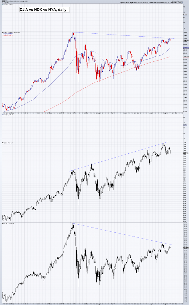
DJIA vs. NDX vs. NYA – this rather glaring and very lengthy divergence is a symptom of a narrowing market. The vast bulk of the uptrend in benchmarks such as the S&P 500 was due to the surge in the “FAANG” stocks (FB, AAPL, AMZN, NFLX, GOOGL) – but even this group of stocks is no longer in uniform tracking mode, as FB has fallen out of bed and NFLX and even GOOGL have begun to look wobbly lately. File under interesting trivia: AMZN and AAPL, the two strongest stocks of the group, reached their highest closing levels to date on September 4, the day after Labor Day(the year-to-date closing high in the NDX was recorded on August 29). In 1929, Labor Day fell on September 2 and the DJIA topped out on September 3.
On Monday the NDX pulled back to its 50-day moving average, which has contained all short-term pullbacks since early May. If we were looking only at the daily price charts of NDX or RUT, we would definitely not call their patterns bearish. Per experience, rising wedges like the one that has recently formed in the NDX (the Nasdaq Composite looks similar) more often than not lead to further upside – contrary to the conventional wisdom on these chart formations.
But these indexes do not exist in isolation. A further advance in the near term seems unlikely, in light of a recent sharp rise in bullish sentiment (consider e.g. Mark Hulbert’s Nasdaq sentiment gauge in this context). Most sentiment and positioning indicators recently returned to very high levels relative to their history but failed to eclipse their January highs.
The next chart compares two major developed market indexes – the S&P 500 Index and the Euro-Stoxx 50 Index. The divergence between these markets has grown enormously. You may be surprised to learn that European stocks actually topped out in early 2015 (a few country indexes surpassed their 2015 peaks, but the same cannot be said for Europe-wide indexes).

SPX vs. EuroStoxx 50 (STOX5E). European stocks already peaked in early 2015, when the initial enthusiasm over ECB QE started to wane. They remain well below their 2015 peak to this day – and this has created what is easily their biggest ever divergence vs. the SPX.

Related Posts
 Shanghai Gold Exchange Has 54 Tonnes Of Gold Withdrawn In The Latest Week
 Bitcoin will survive failure of ‘any giant’ in crypto, Samson Mow says
 Sell Cameron Before Schlumberger Invokes Its MAC-Out Clause
 Precious Metals Report – March 10, 2016
![What Is A Stock? [Infographic]](https://www.riceoweek.com/wp-content/uploads/2016/03/banner-what-is-a-stock-ig-150x150.jpg) What Is A Stock? [Infographic]
What Is A Stock? [Infographic] BTC/USD Forecast: Sees Buyers
No shorting
BTC/USD Forecast: Sees Buyers
No shorting


Leave A Comment