
College Tuition and Fees constitute one of the biggest threats to our economic outlook. Here is a chart of data from the relevant Consumer Price Index sub-component reaching back to 1978, the earliest year Uncle Sam provides a breakout for College Tuition and Fees. As an interesting sidebar, we’ve thrown in the increase in the cost of purchasing a new car as well as the more substantial increase for the broader category of medical care, both of which pale in comparison.
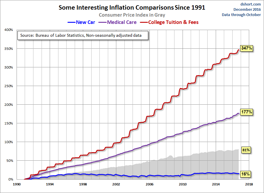
During the decade of the 1990’s, when real out-of-pocket funding declined 25%, tuition and fees rose 92%, which sounds substantial … until you compare it to the 1404% across the complete data series. For early boomers paying for college was sort of like buying a car. But in recent decades, it has become more like buying house, for which the strategy of a minimum down payment is commonplace for first-time buyers.
The annual stair-step rise in college costs seen above is probably the most dramatic visualization of inflation data we routinely produce. The only chart we have that rivals it is our quarterly snapshot, updated earlier today, of federal loans to students from the Federal Reserve’s Z.1 Financial Accounts of the United States (formerly known as the Flow of Funds accounts).
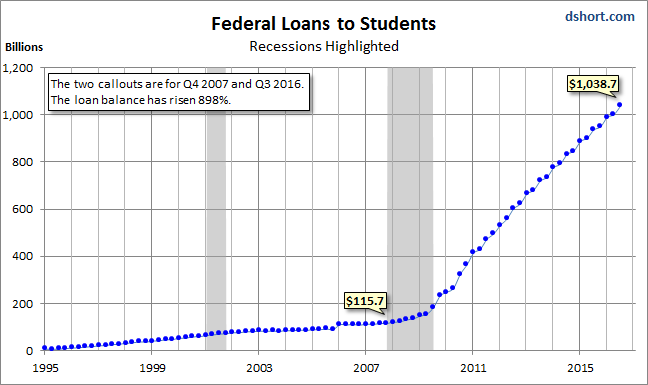
Sadly, the chart above doesn’t illustrate all the student loans outstanding. We don’t have a data source for private loans for college expenses, but the New York Fed estimates total student loan debt to be in the neighborhood of $1.2 Trillion.
An excellent source economic analysis of the impact of tuition debt for the larger economy is the New York Fed, whose economists keep a close watch on this topic. See this slide set (PDF format) posted last year: Student Loan Borrowing and Repayment Trends, 2015.
Note: We’ve updated the quiz based on last week’s Q3 2016 Financial Accounts of the United States (previously referred to as the Flow of Funds Accounts).


Leave A Comment