

In Q3 of last year, Michael Lebowitz and I decided that each quarter we would produce a “chartbook” of the “most important charts” from the last quarter for you to review. In addition to the graphs, we provide a short excerpt from the article as well as the links to the original articles for further clarification and context if needed.
The Federal Reserve Reveals The Ugly Truth
The 2016 survey confirms statements I have made previously regarding the Fed’s monetary interventions leaving the majority of Americans behind:
“However, setting aside that point for the moment, how valid is the argument the rise of asset prices is related to economic strength.
Since companies ultimately derive their revenue from consumers buying their goods, products, and services, it is logical that throughout history stock price appreciation, over the long-term, has roughly equated to economic growth. However, unlike economic growth, asset prices are psychologically driven which leads to “boom and busts” over time. Looking at the current economic backdrop as compared to asset prices we find a very large disconnect.
Since Jan 1st of 2009, through the end of June, the stock market has risen by an astounding 130.51%. However, if we measure from the March 9, 2009 lows, the percentage gain explodes to more than 200%.
With such a large gain in the financial markets we should see a commensurate indication of economic growth – right?”
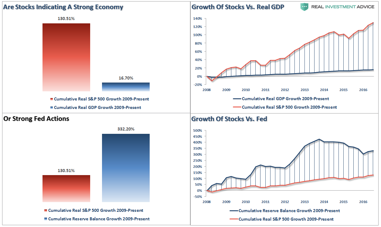
“The reality is that after 3-massive and unprecedented Federal Reserve driven “Quantitative Easing” programs, a maturity extension program, bailouts of TARP, TGLP, TGLF, etc., HAMP, HARP, direct bailouts of Bear Stearns, AIG, GM, bank supports, etc., all of which total more than $33 Trillion, the economy grew by just $2.64 Trillion, or a whopping 16.7% since the beginning of 2009. The ROI equates to $12.50 of interventions for every $1 of economic growth.”
Read: Fed Study: The Bottom 90% And The Failure Of Prosperity
Risk vs. Reward
There are two divergent facts that make investing in today’s market extremely difficult.
In The Deck is Stacked we presented a graph that showed expected five-year average returns and the maximum drawdowns corresponding with varying levels of Cyclically-Adjusted Price-to-Earnings (CAPE) ratios since 1958. We alter the aforementioned graph, as shown below, to incorporate the odds of a 20% drawdown occurring within the next five years.

Over the next five years we should expect the following:
Read: Protecting Your Blind Side
Tax Cut Impact
So, with 80% of Americans living paycheck-to-paycheck, the need to supplant debt to maintain the standard of living has led to interest payments consuming a bulk of actual disposable income. The chart below shows that debt has exceeded personal consumption expenditures. Therefore, any tax relief will most likely evaporate into the maintaining the current cost of living and debt service which will have an extremely limited, if any, impact on fostering a higher level of consumption in the economy.


Leave A Comment