Today’s post will be short and sweet.
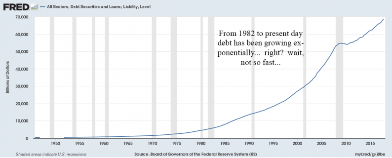
Over the weekend I stumbled upon a chart that plotted the total amount of debt in the United States. It was a scary looking chart and the post’s author used it to justify all sorts of apocalyptic projections.
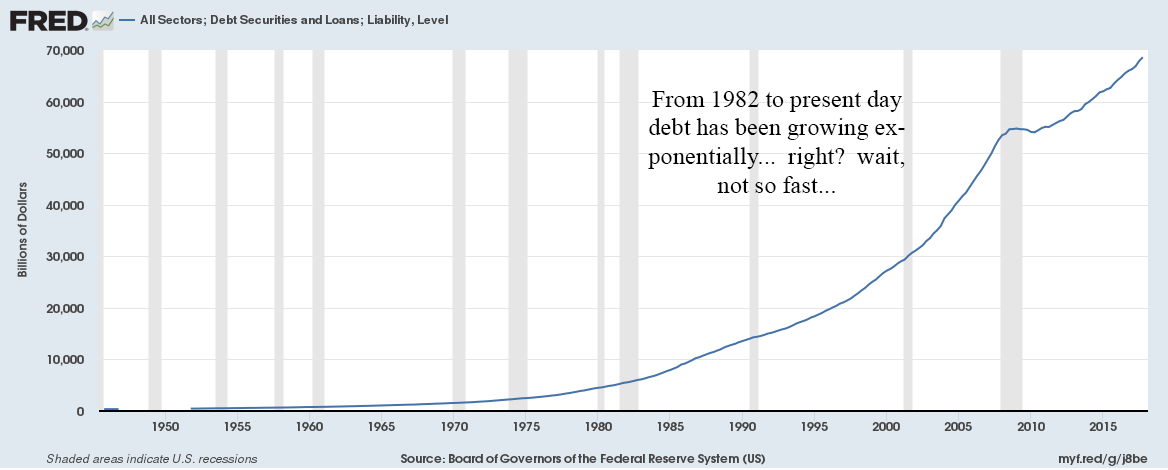
But wait, is this as bad as it seems at first glance?
Bill Gates once famously said, “we always overestimate the change that will occur in the next two years and underestimate the change that will occur in the next ten.” I am not sure Bill was talking about the magic of compounding, and it is tough to take any advice from anyone talked into taking these pictures (see below), but maybe there is a little nugget of wisdom in the words of this Rod Stewart lookalike.

Here is the same graph, but with a log scale. I also added the year-over-year percentage change (red line).
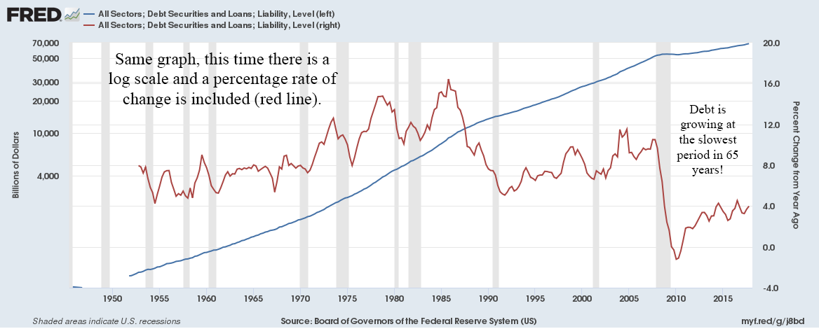
All of a sudden, it’s a completely different graph. Far from debt increasing at an accelerating rate, the last eight years has seen some of the slowest debt growth since the 1950’s.
Be careful of using linear scales over long periods of time.
Here’s another example. It’s not quite the same trick, but also deceptive.
I have noticed articles where American housing bears claim another bubble is being blown in real estate. They will cherry-pick periods to make it look like housing is being built at an astonishing pace.
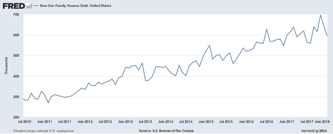
Single family homes have “sky-rocketed” from 300k to 600k over the past eight years. A doubling! It must be unsustainable and irresponsible.
But wait, let’s back the time period out a little.
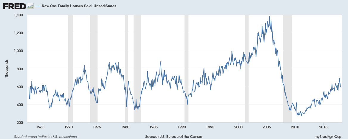
In 2005, the U.S. was building 1.2 million new homes a year! So even at 600k, we are still half of where we were last cycle.
And yet, there is still another trick embedded in this chart. Let’s agree that we are now approximately at the average rate of home building that we experienced over the past five decades. Tough to argue against that logic.


Leave A Comment