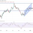
Large-cap stocks are seeming to offer a little reprieve from an ultra-violent start to 2016. Small- and mid-caps weren’t so lucky. They’re continuing to rip through fresh new lows.
This has been the toughest bull market and bubble to call, as many leading indicators that we have used in the past simply don’t work since central banks hijacked the markets after 2008. But with these major divergences continuing to build, and after many years of the Fed’s zero-percent interest rates, it seems we’re finally coming close to the end.
You just can’t have a recovery that’s driven entirely by government stimulus. It only works when consumers start spending again and businesses expand to meet the demand otherwise you prevent the economy from rebalancing naturally, and only encourage greater speculation and bubbles… and that’s exactly what these bogus policies have done.
I’ve been warning more and more strongly from late 2014 forward that this bubble finally looked like it was peaking after going much longer than anyone could have imagined. But into May of 2015 it continued to edge up to slight new highs. Since then we have continued to make lower highs on each rally – what I call a “rounded top pattern.”
But there’s a classic indicator that tells when a major bull market or bubble is finally peaking. I was suspicious that this indicator would not work this time in such an artificial market and economy. But it’s working like a charm.
That indicator occurs when small-cap stocks greatly underperform large-cap stocks. This is a sign that the dumb money is piling in and the smarter money is exiting. It’s like the generals advancing without the troops.
Analysts use the advance/decline line to measure this phenomenon. But since it can get confusing, here’s a simpler take on it: the value line geometric index (the blue line in the chart below).


Leave A Comment