
Here is the opening statement from the Department of Labor:
In the week ending October 27, the advance figure for seasonally adjusted initial claims was 214,000, a decrease of 2,000 from the previous week’s revised level. The previous week’s level was revised up by 1,000 from 215,000 to 216,000. The 4-week moving average was 213,750, an increase of 1,750 from the previous week’s revised average. The previous week’s average was revised up by 250 from 211,750 to 212,000. [See full report]
This morning’s seasonally adjusted 214K new claims, down 2K from the previous week’s revised figure, was slightly worse than Investing.com forecast of 213K.
Here is a close look at the data over the decade (with a callout for the past year), which gives a clearer sense of the overall trend in relation to the last recession.
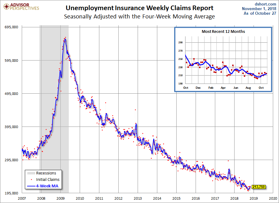
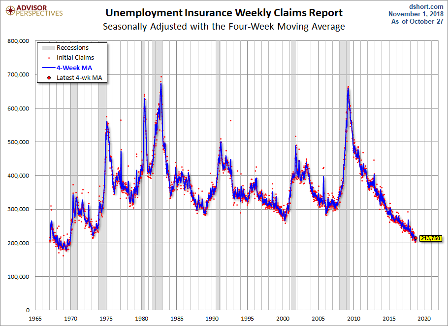
As we can see, there’s a good bit of volatility in this indicator, which is why the 4-week moving average (the highlighted number) is a more useful number than the weekly data. Here is the complete data series.
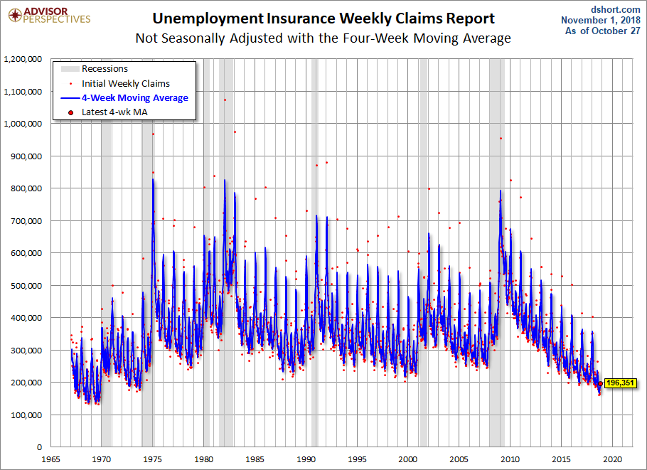
The headline Unemployment Insurance data is seasonally adjusted. What does the non-seasonally adjusted data look like? See the chart below, which clearly shows the extreme volatility of the non-adjusted data (the red dots). The 4-week MA gives an indication of the recurring pattern of seasonal change (note, for example, those regular January spikes).
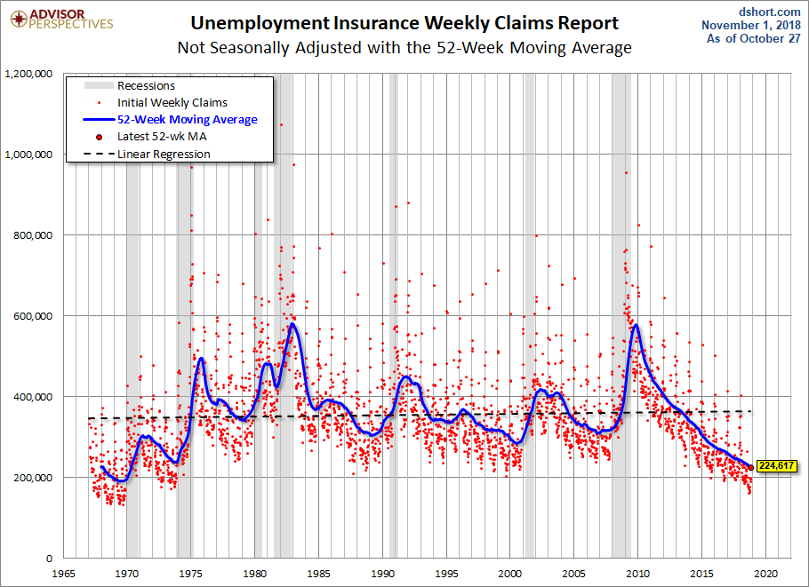
Because of the extreme volatility of the non-adjusted weekly data, we can add a 52-week moving average to give a better sense of the secular trends. The chart below also has a linear regression through the data. We can see that this metric continues to fall below the long-term trend stretching back to 1968.
Annual Comparisons
Here is a calendar-year overlay since 2009 using the 4-week moving average. The purpose is to compare the annual slopes since the peak in the spring of 2009, near the end of the Great Recession.


Leave A Comment