
The Dow Jones this week closed at new all-time highs for each trading session, with Friday’s being the 70th new all-time high since last November’s election. That’s 70 of the 240 NYSE trading sessions since November 8th closing at a new all-time high; better than one day out of four (29%). And it goes without saying that none of the other three out of the four closed more than 3.5% away from an all-time high. The closest it got to that was on April 19th, when the Dow Jones declined 3.37% from its last BEV Zero in the BEV chart below.

There’s nothing magical about this 3.5% in the BEV chart above; if anything the -5% line is the current critical level. And it’s important noting the Dow Jones hasn’t closed below its BEV -5% line above since June of 2016, a long time ago.
What could this mean? Moving to the chart below, it could mean the end of the world as we know it is drawing nigh. Below I’ve plotted the Dow Jones since January 1900. In the insert we see the Dow from 1900 to 1936, and the first financial bubble inflated into the financial markets by our Federal Reserve – the Roaring 20’s. With each boom comes the bust. And as night follows day, Mr. Bear’s deflation of the 1920’s bubble is also on display – aka the Great Depression.
In the chart’s insert, note how since 1904 the 50 level proved a dependable bottom in market declines. Then came July 8th 1932, where Mr Bear took the Dow Jones down to 41.22, a level not seen since the turn of the 20th century. In September 1929, as the Dow Jones made its last all-time high of the Roaring 20s, no one could have seen that coming, how it must have hurt when it happened.
“The nation is marching along a permanently high plateau of prosperity.”
– Irving Fisher, Yale University October 23, 1929
(6 days later Black Tuesday occurred)
How much pain did the July 1932 bottom of 41.22 cause? I’ve seen the documentaries and read the books on the Great Depression, but on a personal level I haven’t a clue.
However, looking at the Dow Jones advance since 1980, I have to believe the Federal Reserve’s 21st century stock market bubble (actually three bubbles stacked on top of each other) is magnitudes worse in duration and scale than anything they did in the 1920’s, ergo the deflation to follow will be greater than what Mr. Bear did in the 1930’s.
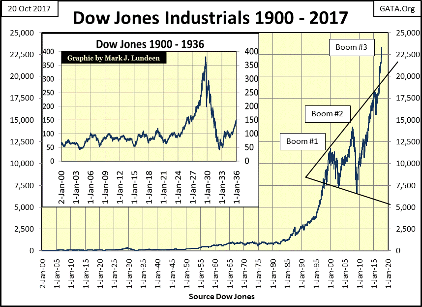
Most “market experts” claim the current rise in the stock market is economic “growth.” It’s growth alright; growing like a tumor. Print this chart and post it on your refrigerator, as it may be the most important chart of our current stock market advance. THE chart future market historians will use to best illustrate the cause of our pending greater depression.
Note the devastating deflation following the Federal Reserve’s first bubble market in the 1920’s. It was a bubble the Fed inflated for only five years, taking the Dow Jones up some 300%. And to be accurate, it wasn’t just the stock market the Federal Reserve inflated in the 1920’s. In the 1920’s they also inflated bubbles in consumer finance, auto loans and real estate too.
Does that sound familiar? The only details lacking from today’s situation are a few trillion in school loans, and the bogus academic degrees they financed burdening young people, and the multi-hundred trillion dollar derivative market threatening to take out the global banking system should (when) interest rates rise above some unknown threshold. If our current situation sounds worse than the credit abuses of the Roaring 20’s, it’s because it is.
Now look at the Federal Reserve’s current bubble in the Dow Jones. Like the Dow Jones 50 level in the early 20th century, the 1000 level in the Dow Jones is also significant, a level the Dow Jones could not break above, and stay above from 1966 to 1982. Then came 17 December 1982, and the Dow Jones hasn’t closed below 1000 since.
Since December 1982, the Federal Reserve has inflated not one, not two, but three massive inflationary bubbles in the stock market. And now, at the end of this week, the Dow Jones finds itself closing above 23,000 with little to no concern expressed by today’s “market experts.”
In the process of inflating this bubble, the world has totally changed over the past four decades. In 1982, thrift was still widely seen as a virtue, so people had savings and saw the wisdom of avoiding debt. Four decades later this is no longer true, for individuals, the corporations who trade on the NYSE, or for government at all levels.
It’s fair saying that to inflate this bubble, the assets of 1982 that people and institutions then held free and clear have all been collateralized by 2017, leaving only inflated financial assets (see Dow Jones chart above) as reserves against future calamity by people, business and government.

Related Posts
 USD/JPY Prolongs Bearish Decline With More Fibonacci Targets Below
 October 2015 Empire State Manufacturing Index Continues Deeply In Contraction
 A Gold Explorer For The Summertime
 “Winter Is Coming” – Wall Street Economists At Work
 Online content streaming is dead. Long live the music NFTs
 Stocks And Precious Metals Charts – Copping A Plea, Tax ‘Reform’, Non-Farm Payrolls


Leave A Comment