
Last week there were all sorts of articles hitting the newswires about the fact the world’s stock market total capitalization was pushing $100 trillion. This article and chart from Business Insider sums up the reaction:

We first saw the chart in a note from CLSA analyst Damian Kestel: “I almost fell off my chair when I saw this and went to check that Bloomberg hadn’t reclassified some data… but no. I included this chart of total equity market cap in [a previous note to clients] in early June this year. At that point total world market cap was US$74 trillion, it’s now US$93 trillion,” he wrote. (The chart excludes ETFs and the like, so there is no double-counting of single stocks in different indexes.)
What is worrying about the chart is that final, fast peak in 2017. Until then, world market cap looked like any other stock index: A series of incremental gains building on each other over time, with a pronounced dip around the Great Financial Crisis in 2008, followed by a healthy recovery.
This year, the chart just looks insane.
Yes, Business Insider, this year, the chart does indeed look insane. But maybe we should have all listened to Damian Kestel’s gut reaction that something might have been wrong with the data.
Lucky for us, sharp-eyed economist, Bernard Tamler, realized there was a problem with the calculations.

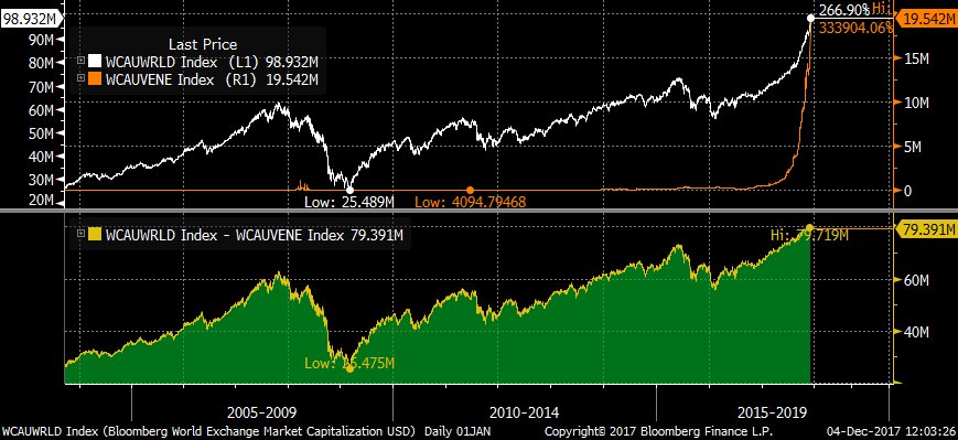
What do you think is the best returning stock market in 2017? The US? Japan? Nah, it’s Venezuela. Yup, you read that right. Venezuela’s stock market is up over 4,000% year-to-date.

Of course this appreciation is not “real” by any means. The Venezuelan currency has been obliterated to zero in the meantime. But the problem was that Bloomberg was still using the “official” currency exchange rate, which was many thousands of times higher than the black market rate. In doing so, they added almost $20 trillion of stock market capitalization to the world’s total.


Leave A Comment