
For the last several years, I have tried to identify several graphs that most bear watching over the ensuing 12 months. This year, in addition to watching bond yields like everybody else, the data that most bears watching, it seems to me, can be summed up in the question: Is the US economy about to enter a Boom?
The recent economic news has almost all been good. In particular the unemployment rate has dropped as low as 4%. Meanwhile, the GOP certaionly believes — I most certainly don’t — that the recent tax changes are going to unleash a torrent of Capex spending and wage increases (as opposed to mergers, acquisitions, stock buybacks and executive pay bonanzas).
So, is the economy on the verge of firing on all cylinders?
There is no standard definition of a Boom. But since I am a fossil, in my lifetime I have experienced two times when it certainly felt like the economy was working extremely well and on a very broad basis: the 1960s and the late 1990s tech era. The “good times” feeling of both eras was palpable. Employment was rampant and average people felt that their situations were going well.
What distinguished those to eras from all the other economic expansions? I found five markers that stand out, and two that, oddly, didn’t.
Let’s start with the first marker: the unemployment rate (note that the U6 underemployment rate wasn’t reported in its current configuration until 1994, and so is not helpful). In both the 1960s and the late 1990s, the unemployment rate hit 4.5% or below for extended periods of time:
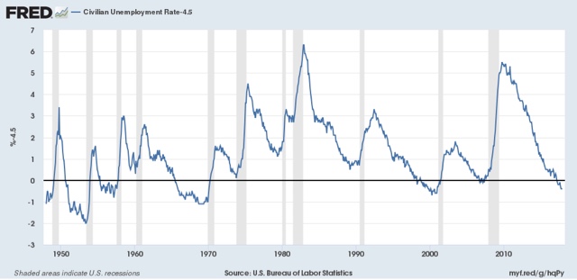
While these weren’t the only two periods of low unemployment, they are among those that stand out, in particular vs. the 1970s and 1980s, none of which expansions hit such a low mark.
Now let me examine the two markers that didn’t make the cut. You would think that industrial production and capacity utilization would be making strong new peaks during Booms vs. other expansions. But that isn’t the case. industrial production (blue, left scale below) has made new peaks during each expansion, while capacity utilization (red, right scale) has been relentlessly declining:


Leave A Comment