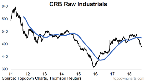
Here’s another stand out chart from my chart packs – it’s the CRB raw industrials index, which as you might guess is a price index constructed from a basket of various industrial commodities (e.g. rubber, cotton, zinc, etc). The reason it stands out is obvious… For reference, the chart shows price vs its 200-day moving average (a rough but useful approximation of telling whether a market is in an uptrend vs down trend). Industrial commodities have fallen off a cliff.
But so what? (why should we care?) and anyway, isn’t it a good thing? isn’t this just like the cost of industrial inputs… so it should be good for companies in that their cost of inputs goes down and so their profit margin will go up? (well… yes, but…)
Key reason is that commodity prices basically reflect 2 things: supply & demand. Generally demand is more cyclical, and changes faster. Generally supply is slow moving (takes time to invest in commodity capex and get supply online). So weaker prices like what we’re seeing here is probably the result of slumping demand, if we run with that logic.
But what about the GSCI?

The CRB raw industrials commodity index is an interesting and good index, particularly for getting a feel for demand cycles, but from an investing standpoint the majority of asset allocators get their broad commodities exposure from an index (usually a total return swap or managed futures fund). One of the key indexes in this respect is the GSCI Commodities Index.
While it is a diversified index, it is heavily skewed to energy.
And while we’ve been seeing some fairly broad-based weakness across commodities, energy has held up. You could say (from a bearish standpoint) that energy may well be the next shoe to drop. However one way to reconcile the two from the standpoint of demand, is that developed economies are running hot (thus ample demand for energy), but emerging economies are under pressure – particularly China. Thus the industrial side of things is justifiably weaker.


Leave A Comment