
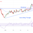
Since February 8 when the Dow Jones broke below its -10% BEV line in the chart below, it’s been building a pennant formation. I don’t know how significant it will be when the BEV plot breaks above or below the pennant, as technical analysis in today’s “regulated” markets isn’t what it used to be. However, I’m still short term bullish, expecting more BEV Zeros in the Dow Jones’ BEV chart before the next major market decline begins. So, I’m expecting the Dow Jones will break above this pennant by first crossing over its -2.5% line, and then increasing to new all-time highs in the weeks and months to come.
Do I have to say should the Dow Jones first break below its -10% BEV line I’ll have to reconsider all that?

The Dow Jones Total Market Group’s (DJTMG) top 20 declined by one this week, from 53 down to 52.

Next is the DJTMG’s top 20 frequency distribution table. There is movement between the BEV Zero down to the -15% columns, from which the top 20 is calculated, but since November the top 20 itself has remained above 49.
This is a trying market for both bulls and bears, as nothing new is developing. We did have the big drop in BEV Zeros in Barron’s February 5 issue. However looking at the table’s –0.001% column (groups just below a new all-time high down to -4.99% from one), it becomes apparent how the DJTMG has only stabilized at a lower level. What do I think of that? Only that this will continue until something changes, which will be clearly evident in the DJTMG’s top 20 chart above and its frequency distribution table below. When that will be I haven’t a clue.

Still, I do note daily volatility for the Dow Jones is once again rising, as seen in its 200 Day Moving Average. As seen below, daily volatility for the Dow Jones bottomed last November near historic lows (0.30%) and has been rising since.
Historically, using this chart for making money in the stock market has been very simple: ‘be emotionally prepared’ to buy the market when daily volatility is at a peak, then hold as volatility declines and sell when it declines somewhere below 0.5%. And I do mean emotionally prepared, as peaks in daily volatility are bear-market bottoms, times where bulls in the stock market are hard to come by. Buying at such times you’ll be doing so as everyone else is selling and that’s not easy. Lows in daily volatility are bull market tops, times where bears like me are widely discredited, but ultimately are proven correct.
So, seeing daily volatility for the Dow Jones bottoming last November, and then rising for the past four months is a very bearish development in the stock market.

Should this development continue until the Dow Jones’ volatility’s 200 Day Moving Average rises to, and then above 1.0%, it won’t be good for the stock market’s bulls. Below is a table for the Dow Jones’ big-bear markets, bear markets where the Dow Jones has declined by 40% or more. I call these market declines 40% Bear markets. With the exception of the April 1942 -51.51% Dow Jones bear market bottom, as well as the August 1896 -44.77% decline, all the other big Dow Jones bear markets noted in the table can be identified in the chart above as its volatility’s 200 Day Moving Average increased above 1.0%.


Leave A Comment