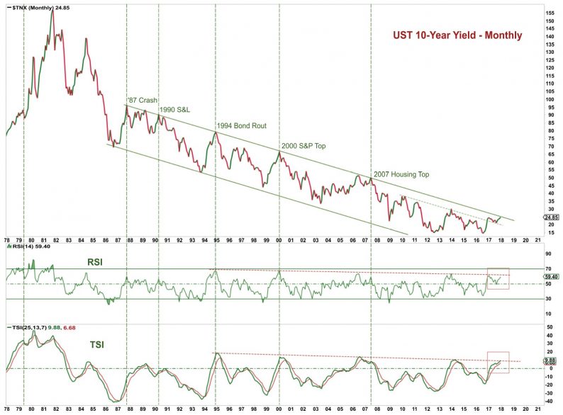
Over the Christmas break, there has been a lot of chatter about this great chart from 13d Research that has been labeled, “the most important chart in the world.”
During the past thirty years, the US 10-year yield has been immersed in a steady decline, with brief run-ups that have coincided (caused?) financial market crises. The 1987 stock market crash, the 1990 S&L crisis, the 1994 bond rout, the 2000 DotCom bubble and the 2007 housing debacle – they were all preceded by a rise in the 10-year US treasury yield.
The trouble with this analysis is that the magnitude of the yield run-up was different each time. The 1990 S&L crisis barely saw a rise, while the 1994 bond rout and 2000 DotCom bubble were much more dramatic. So although this chart is interesting, it doesn’t necessarily help with timing.
Is it the absolute rise that matters? Or is the catalyst the touching of the fabled trend line?
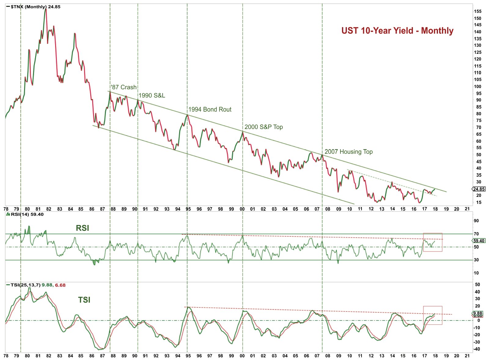
When I tried to recreate this chart, at first I had trouble getting the peaks to tick the trendline.
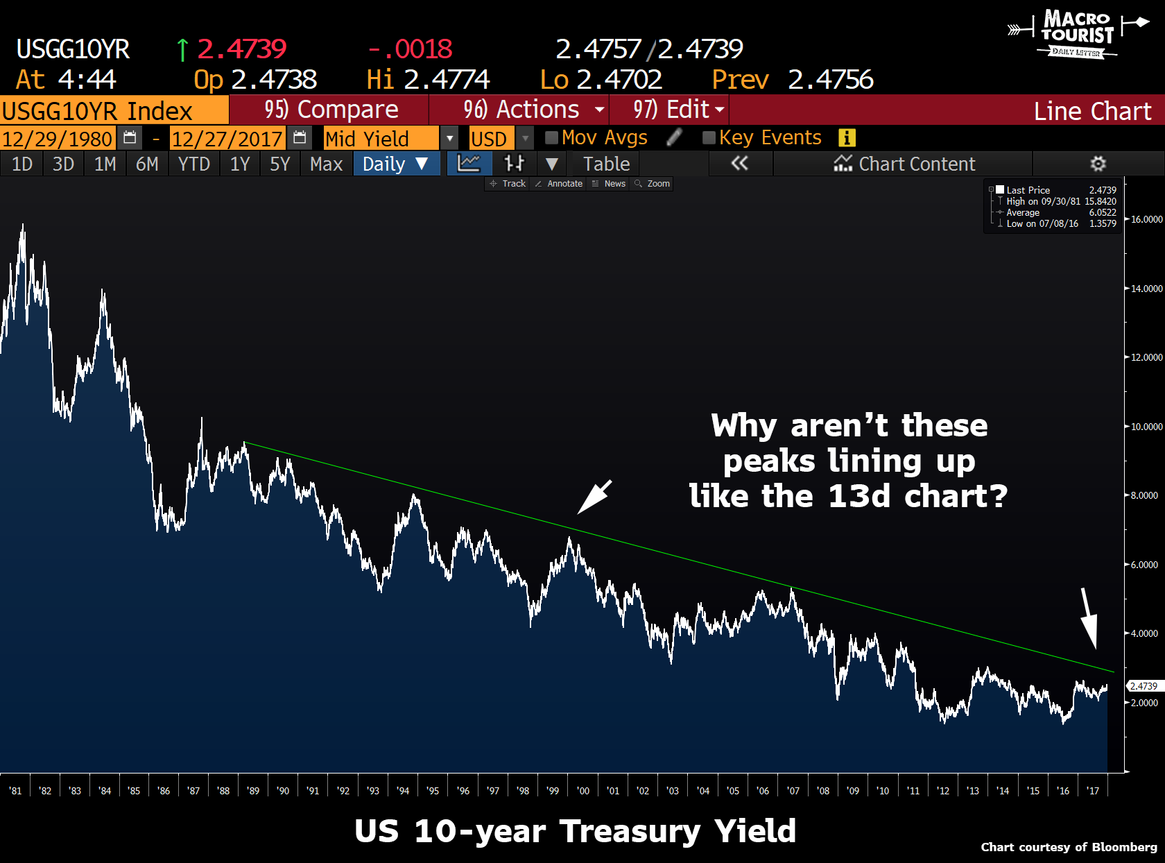
Then I realized the chart had a monthly timeframe, so I tried again.
That’s the ticket! But the fact that the difference between monthly and daily prices can throw off this analysis should be a warning call about the imprecise nature of this analysis. I am not trying to say it is useless, just that this price action should be viewed only in the longest of timeframes. We are talking months, not weeks or days. So to conclude that because the 10-year is currently ticking against this trendline we should expect a crash any moment is foolhardy.
Yet I can’t help but think 13d is correct in calling this the most important chart in the world right now. I am not sure if this trend of lower highs in yield will continue, but investors should give it their utmost attention as it will most likely determine the fate of financial markets over the next year.
Can the economy handle fewer interest rate increases before rolling over? Does the ever-growing-indebted financial system continue to stall at increasingly lower yield levels? And if so, does that mean we are on the cusp of the next great crisis? Will the Fed have inadvertently tightened into the next slowdown?
Or has something changed? Does the obscene pile of Central Bank balance sheet expansion since the 2008 Great Financial Crisis mean that all bets are off? Is monetarism truly dead? Or were the counter-productive fiscal tightenings of the last decade offsetting all the monetary ease, and now that the foot is off the fiscal brake, are we about to experience the full effects of the monetary madness?
I don’t have the answers, but these are the questions investors should be asking themselves.
And embedded into this problem, lies the fate of the yield curve.
If you are a believer that the economy is over-indebted, ready to collapse at the slightest increase in rates, then you probably are quite sympathetic to the flattener trade.
And to a large extent, this is how market participants are set up. Have a look at the CFTC speculative position in 5-year T-note futures.

The market is net short the most 5-year contracts ever. Yup. This is a historic net short position in the 5-year area of the curve.
But this negativity towards fixed income doesn’t persist as you head further out the curve.
Up until last week’s report, specs were actually long the 10-year sector.
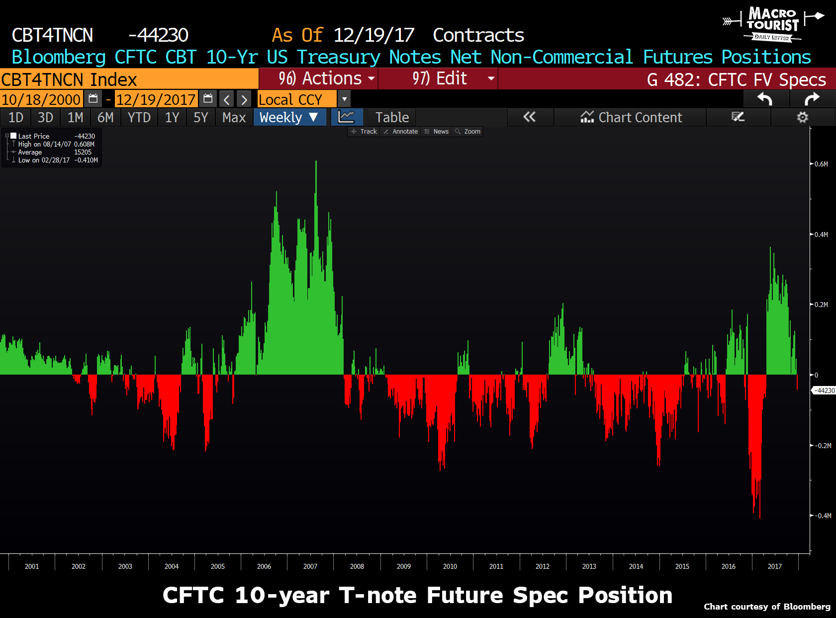
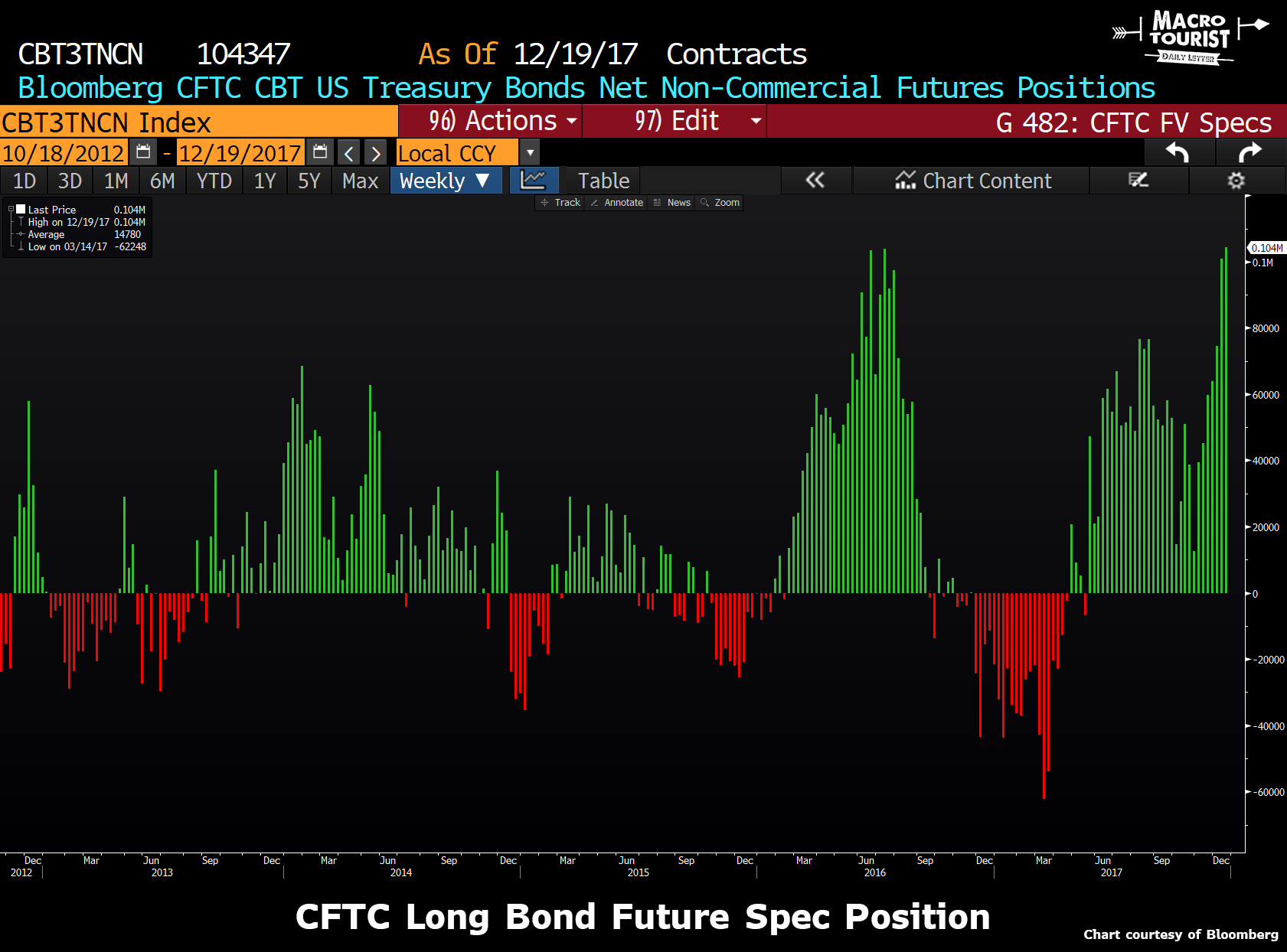
The trend continues with the long bond future pushing up against all-time net long speculative position.
But then, just to confuse us, specs are short massive amounts of ultra-long bond futures.


Leave A Comment