
The chart below reflects the boys and girls and robo-traders of Wall Street enjoying their last game of chart-point Ping-Pong. As is evident, the squeeze is on, and we don’t think this particular triangle “resolves” with another breakout into the financial stratosphere.
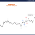
When the market peaked at 2873 on the S&P 500 back on January 26, there were 170 points of daylight between the 50-DMA and the 200-DMA.
Since then, the range has drastically narrowed. As the market has progressively lost its mojo, the 50-DMA (blue line) has steadily declined—even as the statistical momentum of the blow-off top in January has carried the 200-DMA slightly higher.
So now the spread is just 67 points—meaning that the children are running out of playground. And that means, in turn, that a hissy fit can’t be far behind.

The reason is simple: Both props which have levitated the stock market into the nosebleed section of valuation history are now coming undone.
To wit, the Fed has decisively pivoted to QT (quantitative tightening) and will be draining massive amounts of cash out of the bond pits for the first time in modern history; and the Awesome Economy narrative is fast reaching its sell-by date as the current octogenarian business expansion runs out of time and energy.
As to the latter, the fraudulent nature of the Awesome Economy story was again on display on Friday morning with the release of the monthly jobs report. Embedded in it were two juxtaposed charts that in theory can’t happen under the Fed’s bathtub economics macro-model—-bone-headed as it may be.
On the one hand, the BLS report claimed that the April unemployment rate had reached 3.9%. That’s its lowest point since December 2000 and represents full employment and then some by any conventional standard.

On the other hand, the rate of hourly wage gain for production and non-supervisory employees came in at just 2.6% on a year-over-year basis.
That’s the same level its been at for four straight years–even as the unemployment rate has steadily fallen; and it’s far below the 4-5% rates of wage gain which prevailed at the turn of the century when the U-3 unemployment rate last penetrated the 4% threshold.
Needless to say, if the U-3 unemployment rate actually measured labor “slack”, wage rates would be rising smartly.
In fact, it actually measures little more than the statistical noise which emanates from the BLS’ deeply flawed employment models; and is just another component of the statistical pabulum from which the entire Awesome Economy narrative is confected.

To be sure, the talking heads had no trouble espying those missing wage gains as being just around the corner. But that’s the same malarkey they have been peddling since at least 2014 when the U-3 rate first dropped below 6%, which in his wisdom Bernanke had then defined as the borderline of the full employment zone.
So what we are dealing with here is not simply a matter of degree or spin: The Awesome Economy narrative is actually built on institutionalized lies that service the needs of Bubble Finance on both Wall Street and at the Fed—until they don’t.
Then, when financial bubbles inexorably burst, ex-post rationalization stories are fabricated to explain the breakdown.


Leave A Comment