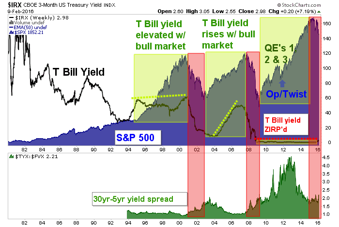
Yesterday we reviewed the Scariest Chart in the World, an overly sensational tongue in cheek title for a chart that has bearish historical implications for the S&P 500. Here it is again. Whether the Fed is looking at this exact combination of data points or something similar, you can bet they are aware that things have come to the brink. The spread in the bottom panel is trying to turn up and that condition has not worked well for the stock market on the last two cycles.

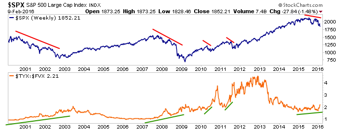
Here is a simpler view that we routinely follow in NFTRH’s Macro Indicators segments…
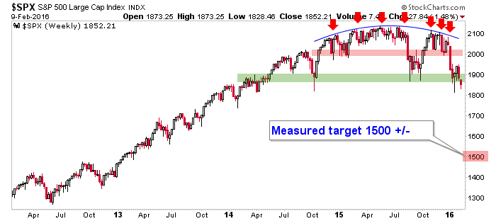
Here is the weekly S&P 500 right on the brink…
And here is a Fed Chair who is going to speak to Congress today…

Ms. Yellen has stated that her Fed does not manage the stock market, it manages the economy. And that may be so, but watching things like yield curves and even the stock market is in fact watching early economic signals. So let’s put that to rest now, they are watching the stock market and the damning macro indicators that have put it in a precarious state.
What can the Fed do to change the current atmosphere where gold is now out performing stock markets and market participants are losing confidence left and right? Well, last time the big brained Bernanke Fed cooked up a little macro manipulation called Operation Twist. This was the act of brilliance that simply painted inflation right out of the picture by “sanitizing” (the Fed’s own word, which is important to note) the bond market. In this case “sanitizing” meant selling short-term Treasury Bonds and buying long-term Treasury bonds.
You will recall that in 2011, the Fed was under fire for the post-2008 inflation problem it had promoted (cue the reference of Bond King Bill Gross’s famous and ill-fated short of the long bond with the expectation that yields were finally going to break out… and cue our favorite macro chart, the 30 year yield, AKA the Continuum)…


Leave A Comment