Over the longer term, it is only an expanding money supply that can push the stock market constantly higher. Since it is usually commercial banks that create new money (except for during banking crises), comparing stock market prices to commercial bank balance sheets can serve as a useful risk indicator.
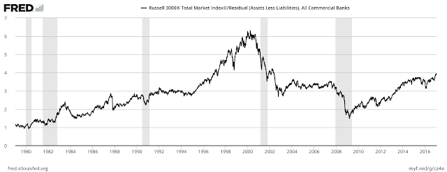
The two graphs below compare the U.S. stock market (represented by the Russell 3000) to 1) banks’ equity (net assets) and 2) banks’ cash assets plus the value of their securities portfolios (parts of which can be exchanged with cash from the Federal Reserve during liquidity squeezes).
All else remaining the same, the higher the ratios the greater the probability of a stock market correction or even a crash. Both ratios, especially the first, suggest stock market prices are at elevated levels compared to key items on bank balance sheets. This could be bad news for the stock market in 2017 and, more importantly, for the U.S. economy as a whole.


Leave A Comment