
Written by Clive P. Maund
All the technical evidence suggests that gold is building out an intermediate top area [at this point in time]…After its parabolic ramp up in January and early February, it has been struggling to make further progress…Although it has edged ahead a little, the passage of time has resulted in its breaking down from the parabola simply by moving sideways, which has, unknown to many, opened up the risk of a potentially severe drop…
The Gold 6-month Chart
The most plausible interpretation of pattern development since the parabolic blow-off spike in early – mid February is that it is a bearish Rising Wedge, which the price broke down from about a week ago, before a backtest of the breakdown point with the big up day last Wednesday when the Fed didn’t raise rates, which triggered panic short covering. The pattern may also be classified as an upsloping Head-and-Shoulders top, but to avoid clutter we haven’t marked this on the chart…

The Gold 1-year Chart
The chief reason for showing the 1-year chart for gold below is so you can compare it with the latest COT chart shown directly below it, which also goes back a year, but this chart does also reveal that gold’s advance ran into trouble when it slammed into the trendline target shown.


Gold’s latest COT shows that Commercial short and Large Spec long positions are still at a very high level, which is bearish. There was a slight drop last week but we should not be fooled by this – these figures were taken for last Tuesday’s close, when gold had been dropping for 3 days and before it blasted higher on the Fed on Wednesday, so it reasonable to presume that the real readings are back up near or even above the highs. These readings strongly suggest that a sizeable drop is looming.
The Gold Hedgers Chart
The latest gold hedgers chart, a form of COT chart, is bearish.
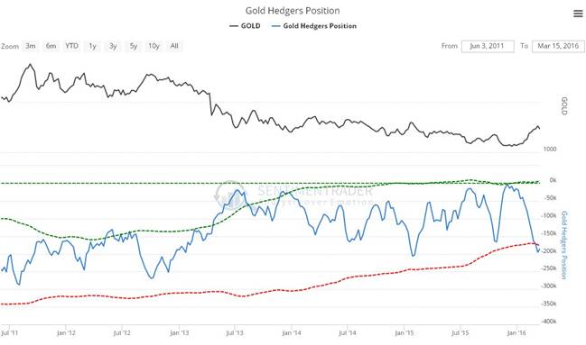
Chart courtesy of www.sentimentrader.com


Leave A Comment