As the consolidation phase continues to build out from this first impulse move up in the precious metals sector lets review some of the charts we’ve looked at previously that suggested the bear market might be over. Most of these charts will be ratio charts which compare different sectors to one another. These rather complex charts can give us some hidden clues that an important reversal may have taken place.
The consolidation process takes its toll on both the bulls and the bears alike. As you know there are never any guarantees of anything when it comes to the markets so it’s always important to try and get the big picture right to get the odds in your favor.
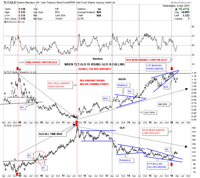
Lets start with one of the more important combo ratio charts we’ve been following which has the TLT:GLD ratio on top and GLD on the bottom. When the ratio chart on top is falling ( Gold is Outperforming Bonds ), GLD is generally rising and vice versa. On the left side of the chart you can see the ratio chart topped out in 2008 while GLD bottomed with both forming H&S patterns. Next in 2011 the ratio chart bottomed out while GLD topped out and started its bear market. Now looking to the right hand side of the chart you can see where the ratio chart on top , topped out on January 16th of this year while GLD on the bottom also put in its bear market low. The ratio chart on top has been rising over the last three weeks while gld has been consolidating, which is to be expected as no market goes straight up or down. So far there is nothing concerning with this combo ratio chart except for a mild correction. As long as the ratio chart trades below the top black dashed horizontal rail the new bull market lives on.

Below is another very important combo ratio chart we’ve been following which shows the GOLD:XAU ratio chart on top and the XAU ( large cap Gold Stocks) on the bottom. This combo chart does a very good job of showing just how undervalued the XAU is to the price of gold. Back in 1996 the ratio chart on top bottomed out at 2.60 while the XAU on the bottom topped at 155, which wasn’t to far out of wack. The parabolic arc shows from that low in 1996, even with the bull market years from 2000 to 2011 gold continued to beat up on the XAU until just recently when the ratio chart on top put in that small double top at 24.33 yellow shaded area. To say the XAU is under valued to the price of gold is an understatement. Think about this for a moment. It has to be one of the most amazing bear markets in history . The price of large cap Gold Miners has been falling relative to Gold for 20 years , even during the most incredible bull market the yellow metal has ever seen ! Ask any Gold Enthusiast and they will tell you , Gold stocks have been a brutal investment choice .


Leave A Comment