It’s not entirely clear when the “enough is enough” moment will come in terms of highlighting charts that illustrate the epochal (and increasingly dangerous) shift to passive versus active management, but I don’t think we’re there yet.
It may just be me, but it certainly seems as though ETFs are getting a lot more attention over the past several months and that’s saying something because they’ve been a hot topic for years.
We – and a lot of other folks – have tried our best to stay abreast of the latest in what’s becoming a vociferous debate. Here are some recent posts for anyone who might have missed them:
Well admittedly, we’re going to milk this topic for all it’s worth and not because we necessarily think you need to see any more charts, but rather because given the rampant proliferation of these vehicles and the associated danger they pose to markets, this is a topic that quite literally can’t get enough attention.
Via BofAML
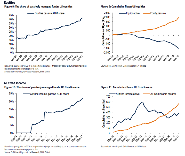
Below we update our report from July. The trend of flows shifting to passive investments has been impacting equities for over a decade (Figure 8, Figure 9). For fixed income the shift accelerated following the Taper Tantrum rise in interest rates in 2013, and re-accelerated again in November of last year (Figure 10, Figure 11, Figure 12, Figure 13). In high yield, on the other hand, the share of passive funds and ETFs remains relatively low (Figure 14, Figure 15).


Leave A Comment