 Image Source: UnsplashWith the first ten months of the year now out of the way, a mere one-sixth of 2023 remains. Considering how absolutely insane this year has been already in all arenas (financial, geopolitical, legal, you name it), one can only tremble to consider what the next two months might hold.Rather than dare speculate on the dozens of weighty matters already vexing the globe, I will simply focus on an octet of cash index charts along a common theme: the notion that each of them has hammered out a formidable and well-formed topping pattern and that, preposterous as it might seem to the mainstream pundits (and flying in the face of endless-cited bullish seasonality), it is within the realm of possibility that new lows for 2023 could be on hand for at least a few major indexes.For simplicity’s sake, the format of each of the charts below is consistent. Specifically:
There are a few basic drawn objects to highlight what I consider important patterns and levels of support/resistance;
In some cases, a pink semi-circle offers a boundary for what I consider to be a reversal pattern;
A green-tinted area approximates the important overhead supply for any given index and, thus, an area that should be quite resistant to easy price ascent;
A red rectangle shows the potential “drop zone” for the balance of the year. To be clear, it’s virtually impossible to know what a stock or index is going to do the next day, let alone the next two months, so do not interpret this red rectangle as some kind of firm prediction. Instead, it represents the prospective risk area through which prices could move, based on an approximate measured move or some meaningful support level beneath the price presents.
Having said all that, let’s go through the indexes one by one. We begin with the all-important S&P 500: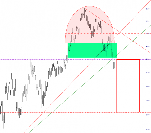 Next is the Dow 15 Utilities, which is the only one of these that has two “drop zones” and two areas of resistance (one green, one yellow, the latter of which would be easier to penetrate). The smaller, higher one is, by definition, the high probability one, since it is less dramatic of a drop. If the UTIL were to cut beneath this region, it would mean that it had broken a multi-decade trendline, and the index (and the market as a whole) might be in for a truly historic plunge.
 Major Market Index:
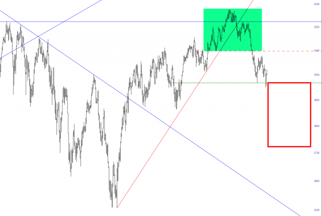 The Semiconductor Index (which is pretty much at the mercy of NVDA):
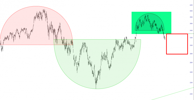 The Russell 2000 index, which has been range-bound for the past two years but could potentially work its way to its next Fibonacci level lower.
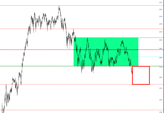 The S&P 100 index:
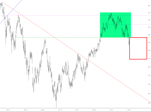 The NASDAQ 100, which is also prospectively heading to its next lower Fibonacci level as major support:
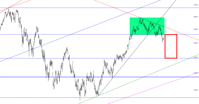 And, finally, the NASDAQ Composite:
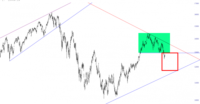 Considering the propensity of the federal government to bail out markets that are in trouble, it would seem highly likely that the scenario suggested by all the red rectangles above would compel them, once again, to plunge the nation even more trillions in debt just to stave off further drops in equity prices. Japan has been doing this for decades and, oddly, it seems to have worked so far.When it stops working – – and it seems inevitable that it will one day – – the potential repercussions are too staggering to consider.More By This Author:It’s a Sine of the TimesA Tenth Life?Checking In On ETFs


Leave A Comment