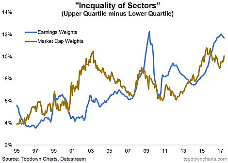
When you say the words ‘rising inequality’ it raises all sorts of connotations and thoughts, but in this ChartBrief we look at a peculiar angle on inequality – inequality in sectors in the S&P 500. There has been an interesting uptrend in the gap between the largest and smallest sectors both in terms of market cap and earnings contribution. While the metrics got blown out during the dot com boom and financial crisis, the trend is still up. A key driver is the technology sector which has gone from strength to strength in both market cap and earnings percentage share representation.
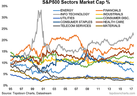
Looking across sectors on market capitalization representation there has been a noticeable shift in composition across time. It’s important to keep tabs on changes in composition. In the new investment world where passive investment is becoming increasingly popular due to seeming skepticism on active management and fee pressure, the importance of sector composition of indexes will become more important. And the numbers show that the S&P 500 is becoming more concentrated.
This chart shows the difference between the upper quartile and lower quartile across the S&P 500 sectors for market capitalization and earnings, and there is a clear trend upwards. This means the larger sectors are becoming bigger than the smaller sectors in both market cap and earnings.

The below graph shows the main S&P 500 sector representation by market capitalization.


Leave A Comment